School project S5 – Beer branding part 5 : The brand book
For this branding project we have to develop the visual identity, the packaging and the advertising campaign for a beer. Here is part 5 of the creative process behind this project.
The Brand book
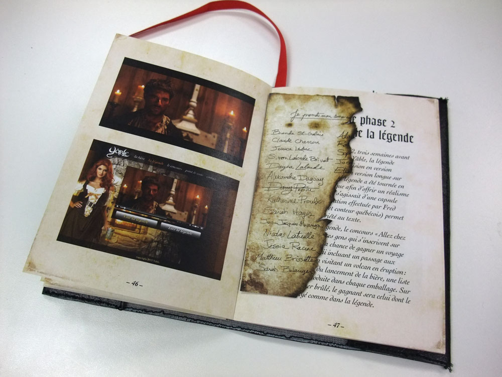
To stay within the concept of the early colonists of New France and this era controlled by religion, the brand book was design to look like a old bible. A hand crafted black leather slip cover with the gold leaf Yâble logo was made to include a 64 pages booklet (5×7 in). Each section of the book was sewed by hand. Everything you need to know about the project is in this book. You can browse through the flash version of the book by clicking HERE (click and drag the top right corner to turn the page).


copyright Dany Pepin 2011
School project S5 – Beer branding part 4 : The ad campaign
For this branding project we have to develop the visual identity, the packaging and the advertising campaign for a beer. Here is part 4 of the creative process behind this project.
The ad campaign
Now we need to sell this beer.
The target audience is the french canadian male from Quebec from age 20-50 who loves tradition and tasty crafted beer. The province of Quebec was chosen because the market of craft beer is well developed and because products from the heartland are popular and well promoted. This beer has the Quebec authenticity and tradition that will reach the target audience.
The ad campaign is based around a fictional story (legend) from the early 1600-1700. Using a story to explain the origin of a beer is rare and will set itself apart from other beer promotions. The legends is called « La cabane du Yâble » (The devil’s cabin). Many elements from the campaign will be taken from the story.

(Story in French only)
Il y a très longtemps par une froide nuit de janvier, un groupe de bûcherons surpris par une terrible tempête tentent de retrouver leur chemin vers le village. Perdus, ces hommes des bois réalisent que cette nuit sera peut-être leur dernière. Soudain, le plus jeune d’entre eux aperçoit une lueur entre les branches. Tous se dirigent hâtivement vers ce qu’ils croient être le village, mais découvrent une cabane de bois au milieu d’une clairière d’où retentissent des chants festifs.
Le chef cogna à la porte et fût accueilli par une séduisante jeune femme aux cheveux roux. Il lui demanda: « Auriez-vous la bonne âme d’aider de désespérés voyageurs? » « Mais certainement » répondit-elle. « Vous êtes les bienvenues ». Les bûcherons se dirigèrent vers une table près du foyer pour s’y réchauffer. L’endroit était rempli, car de nombreux draveurs, chasseurs et trappeurs y festoyaient, houblon à la main.
La jeune femme revint offrir aux bûcherons une bière noire en échange de quelques écus. « Goûtez moi ça » dit-elle, « Cette bière a un p’tit goût de l’enfer ». Les heures passaient et le houblon coulait à flot. Bière après bière, la jeune femme ensorcelait ces gaillards enivrés jusqu’à ce qu’ils n’aient plus de quoi payer. L’ensorceleuse revint avec un bout de papier et dit d’un regard séducteur : « Signez ici et promettez vos âmes que vous reviendrez payer vos dus ». Ivres, ils signèrent sans hésitation afin de pouvoir continuer à consommer cet élixir enchanteur.
La nuit de débauche continuait et tous tombaient dans le délire collectif entretenu par la jolie rousse. C’est alors que le plus jeune des bûcherons sentit une brûlure sur sa poitrine. La croix qu’il portait fièrement venait de lui brûler la peau tel un fer rouge. Il regarda ses compagnons ivres puis la jeune femme qui le transperça alors de son regard enflammé. Le jeune homme compris aussitôt qu’elle était une incarnation du diable. Il prit son manteau d’une main et attrapa son plus proche compagnon de l’autre pour déguerpir de la cabane. Dès la porte franchie, son confère s’enflamma et fut transformé instantanément en cendre. Courant dans la neige, il entendit un rire masculin maléfique atténué par la musique du violon.
Heureusement pour le jeune homme, la tempête c’était atténué. Grâce à la lueur du matin, il retrouva finalement le chemin vers le village où il ne tarda pas à rejoindre ses habitants. Puisque personne ne croyait son histoire, il alla voir le curé pour lui raconter son aventure. « J’te crois mon fils. Ta foi en dieu t’a sauvé »: dit le curé. « Le port de ta croix t’a protégé de cet élixir et empêché d’avoir le yâble au corps comme tes compagnons. Que Dieu les pardonne ».
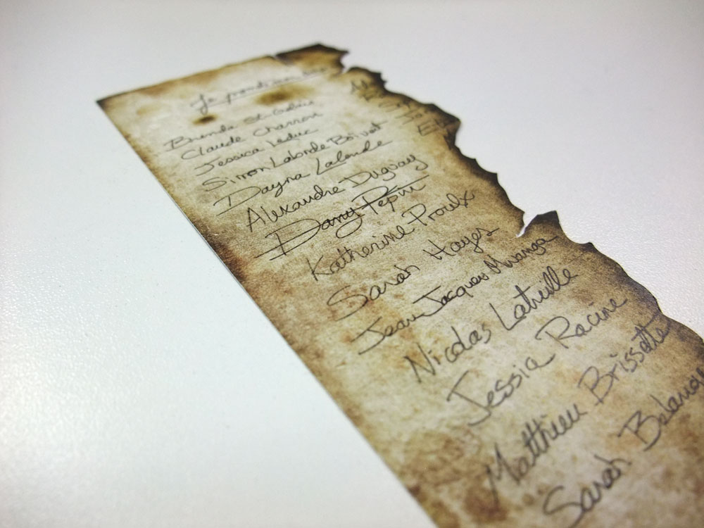
Le printemps suivant, le jeune bûcheron retrouva la clairière où se cachait la cabane du diable. Au sol gisaient les vestiges d’un incendie. C’est alors qu’un bout de papier brûlé et noirci attira son attention. Ce bout papier comportait une liste partielle de noms au-dessus de laquelle on pouvait lire: « Je promets mon âme au… ». Son nom et ceux de ses compagnons y figuraient, mais le sien avait été rayé.

AD CAMPAIGN PHASE 1
To create a buzz around the product, a teaser poster is created and distributed at different S.A.Q. establishments. The teaser poster shows a red head woman with the Yâble «Y» burnt on the skin. The phrase “Discover the legend 19/11/2012” leads the reader to the website where a countdown to the launch of a “movie style” commercial. The tagline “Le Yâble au corps”, the red head woman and the burnt skin are references to the legend.

AD CAMPAIGN PHASE 2
November 19, 2012, three week before the launch of the beer, the legend appears on TV (short version 30 sec.) and on the website (long version 60 sec). The ad is filmed with a cinematic style to add realism to the visuals and a sense of history. The actors do not have lines, only the voice of a narrator is heard over the visuals.
Along side the commercial, the contest « Allez chez le yâble ! » (Go to hell!) is launch on the website. Visitors are invited to subscribe and win a trip. The name of the randomly selected winner will be written and crossed out on a burnt piece of paper inserted inside each packaging box. This is also a reference to the story.

AD CAMPAIGN PHASE 3
December 10th, 2012 is the official launch of the Yâble beer in participating S.A.Q. across Quebec. The holidays period was chosen for the launch because it is the period of the year where the most beer, wine and alcohol are bought. The holidays is also a good time to air the TV ad because of the ratings during this time of the year.
In participating S.A.Q., a special isle is placed to showcase the new wood packaging and will be held by a female representative of the brand dressed as the devilish red head. She will offer free sample of the beer. During this promotion, a beer mug with the image of the Yable will be offered at each purchase.
AD CAMPAIGN PHASE 4
As the summer approaches, a second series of posters will be created using the expression « Un p’tit goût de l’enfer » (A little taste of hell) as mentioned in the legend. This time, the posters will use visuals from the legend. The use of this phrase is a reminder of the brand and a reference to the presence of the promotional team during the beer and summer festivals in Quebec. At these events, a promotion kiosk will be held by young women dressed-up like the lady/devil from the legend. Each person who enjoyed a Yable will receive a temporary tattoo (“Y” from the brand). This tattoo will be immediate promotion on site. This promotional product is used only during the summer, because people walk around with short clothes exposing their skin.

AD CAMPAIGN PHASE 5
This last step is key to keep the Yâble trademark active years beyond the original advertising campaign. The legend will be forgotten after one year, so a slight change of direction is planned. While keeping in mind the Quebec origin of the beer (legend), the maintenance of the brand will be through the use of random French Canadian expressions using the word devil. The long-term promotion will mostly use print like Mediacom road signs and Zoom Media posters in different establishments. The website and a Facebook page will continue to maintain the brand on the Internet. The number of available expressions allows maintenance of the brand for a long period of time.

copyright Dany Pepin 2011
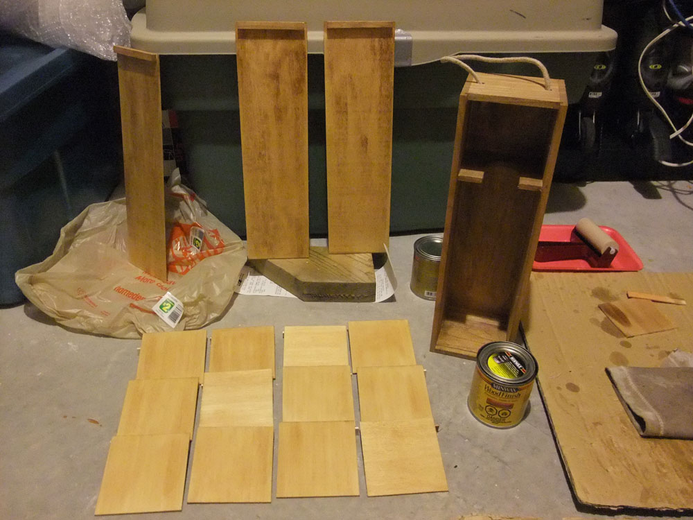
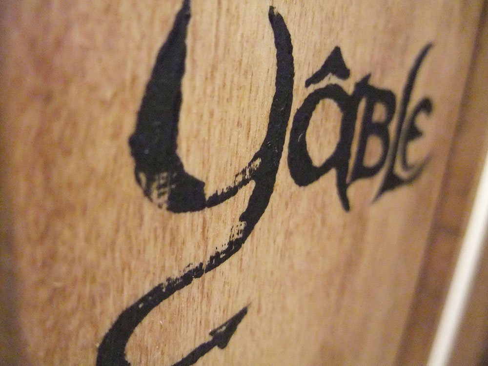
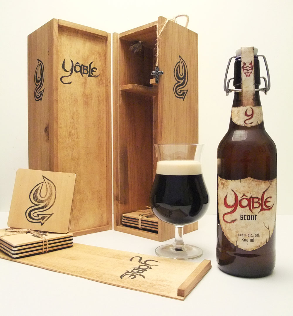
School project S5 – Beer branding part 3 : The packaging
For this branding project we have to develop the visual identity, the packaging and the advertising campaign for a beer. Here is part 3 of the creative process behind this project.
The packaging
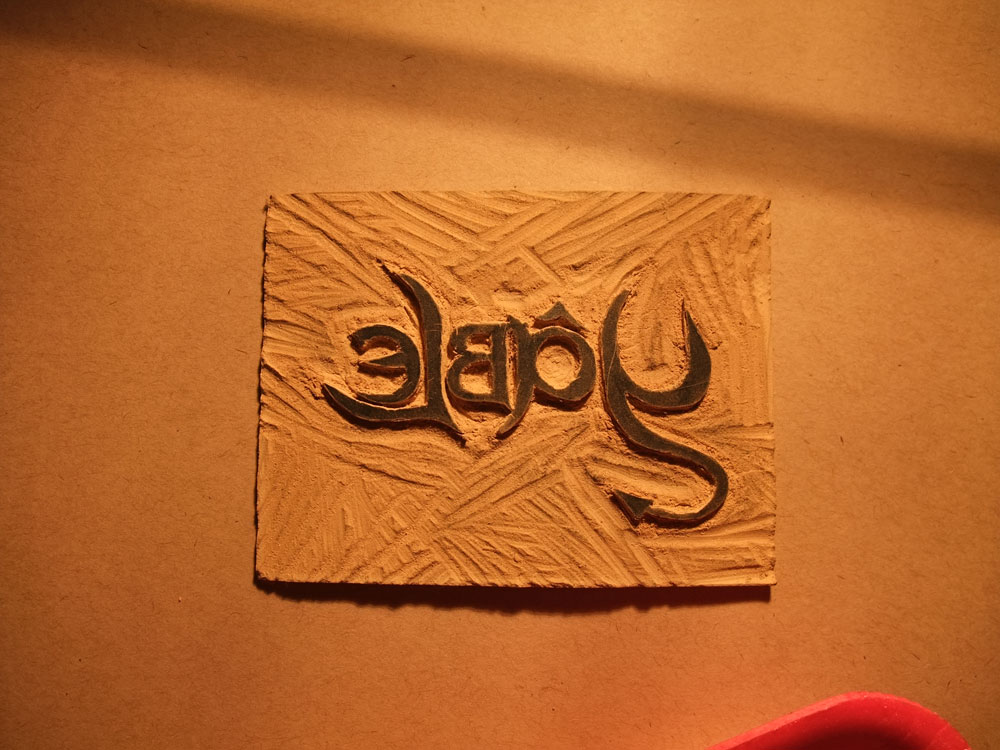
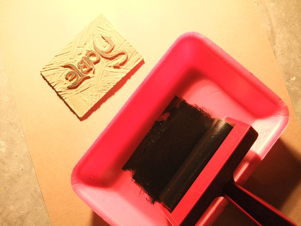
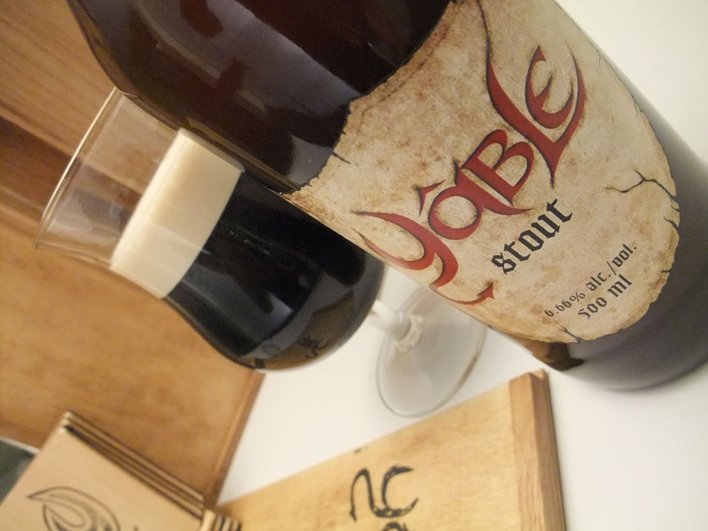
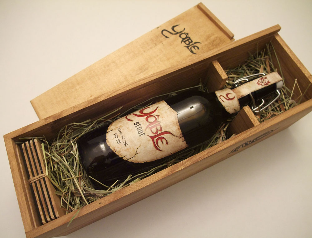
Time to be crafty. To convey the time period of the 1600-1700, I decided to use a wooden box as the packaging for the beer. Using this material recalls the days when alcohol was transported in wooden crates. Not only the packaging is made of traditional materials, but I used a manual printing technique to apply the logos on the box. So I had to carve out the word mark in reverse on a linoleum plate. A wood stain was applied to the inside and outside of the box and complementary coasters. This stain darkens the package and also gives emphasis on the wood grain giving the wood more character. A handmade packaging adds to the authenticity and tradition that the product is trying to convey.


copyright Dany Pepin 2011
School project S5 – Beer branding part 2 : The labels
For this branding project we have to develop the visual identity, the packaging and the advertising campaign for a beer. Here is part 2 of the creative process behind this project.
The labels
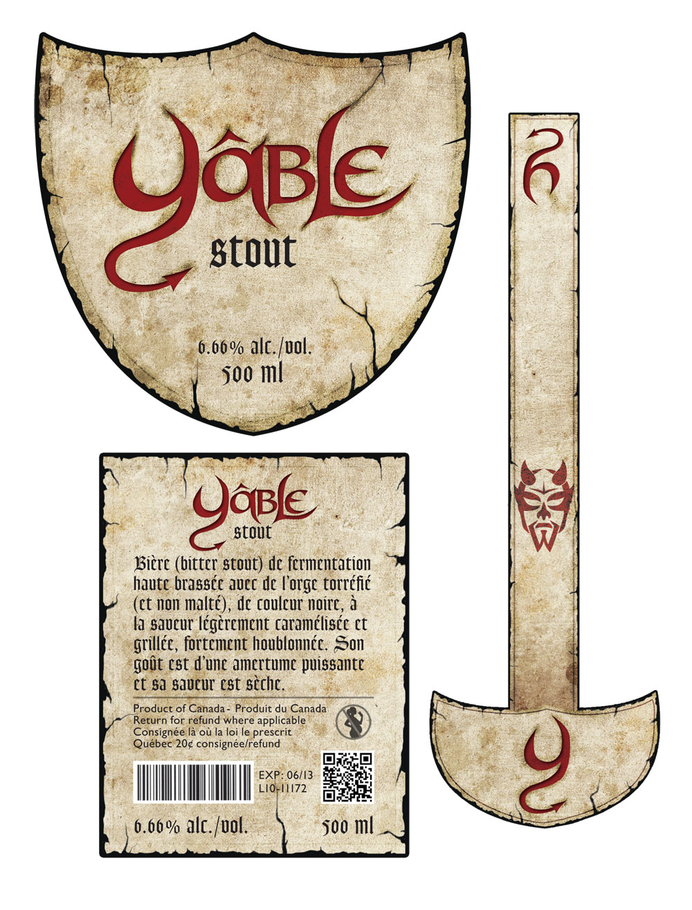
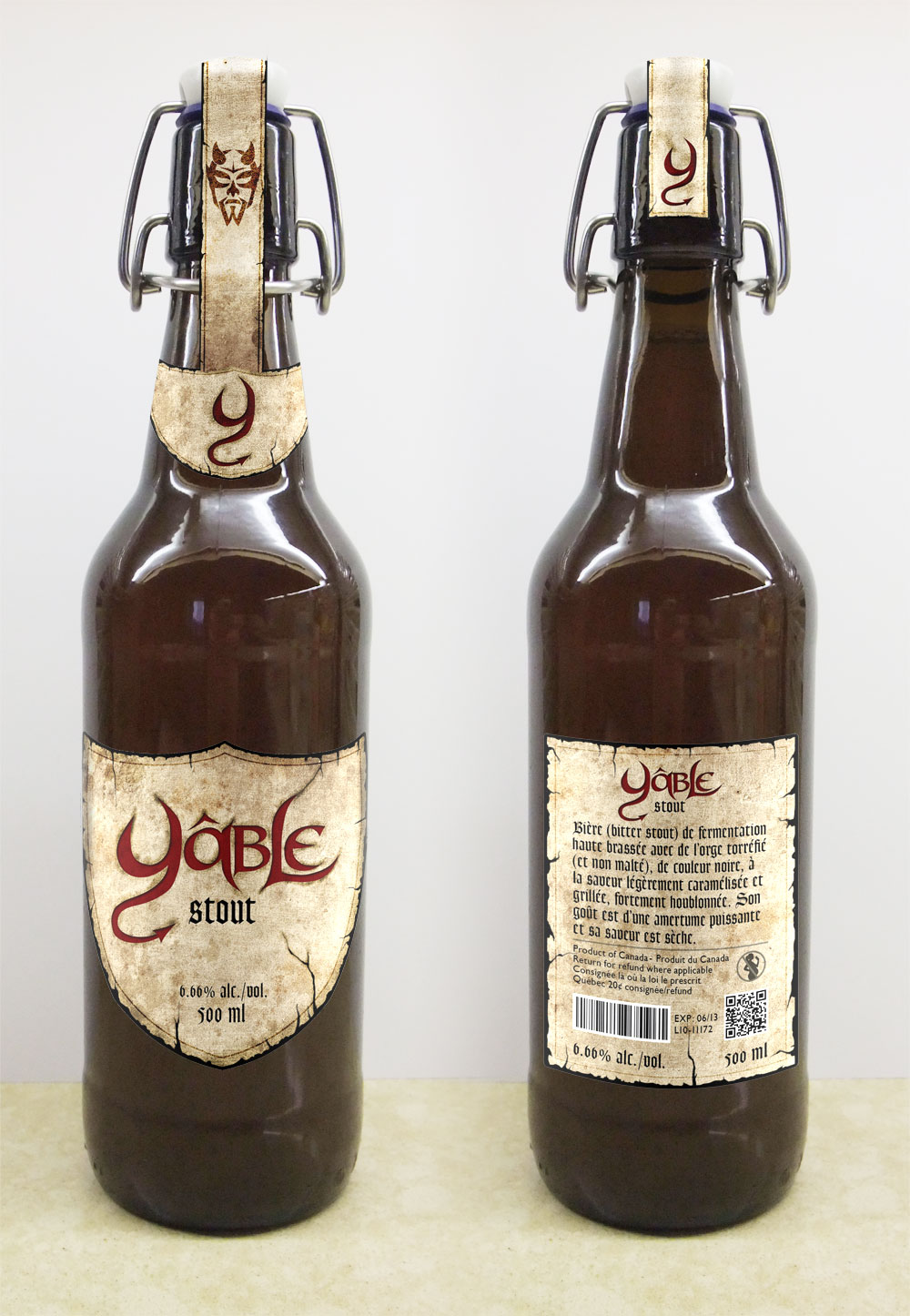
Because this beer is inspired by tradition, folklore and the heartland of Quebec, I had to go back in time and develop a visual that would reflect this period. I wanted a label that looked old and worn. A label that seemed to have been made a long time ago. The shape of a shield made out of worn paper with gothic letters made the effect I was looking for. Since the bottle was dark brown, a beige label created a excellent contrast.
Sketches


Front, back and top labels
Photoshop mockup
copyright Dany Pepin 2011
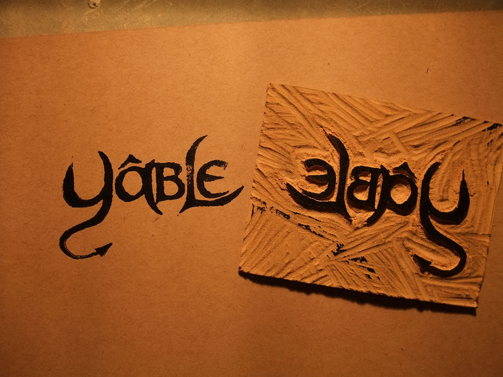
School project S5 – Beer branding part 1 : The logo
For this branding project we have to develop the visual identity, the packaging and the advertising campaign for a beer. Here is part 1 of the creative process behind this project.
The logo
After several hours of brainstorming an idea came to me. The concept of a craft beer from Quebec was created around the word Yâble (french-canadian slang for “devil”). The devil (Satan, Lucifer, Beelzebub), is a symbol rooted in folklore and in the history of Quebec due to the religious authority which our ancestors lived by. The Devil is also the subject of many legends and is often associated with temptation. In the case of this beer, the temptation to drink and the pleasure associated to it.
Instead of a logo, the Yâble will use a word mark (logotype). The letters of the word mark have been reworked to make it more representative of the devil (pointy horns and forked tail). The Y is the most important letter because it will be reused individually later on as the branding strengthen. The overall look also reminds us of the early colonists of Quebec. Scarlet red letters were chosen because it is the traditional colour associated with the devil and because the colour also represent strength and interdiction, two concepts conveyed in this branding.


copyright Dany Pepin 2011
