School project S5 – Beer branding part 3 : The packaging
For this branding project we have to develop the visual identity, the packaging and the advertising campaign for a beer. Here is part 3 of the creative process behind this project.
The packaging
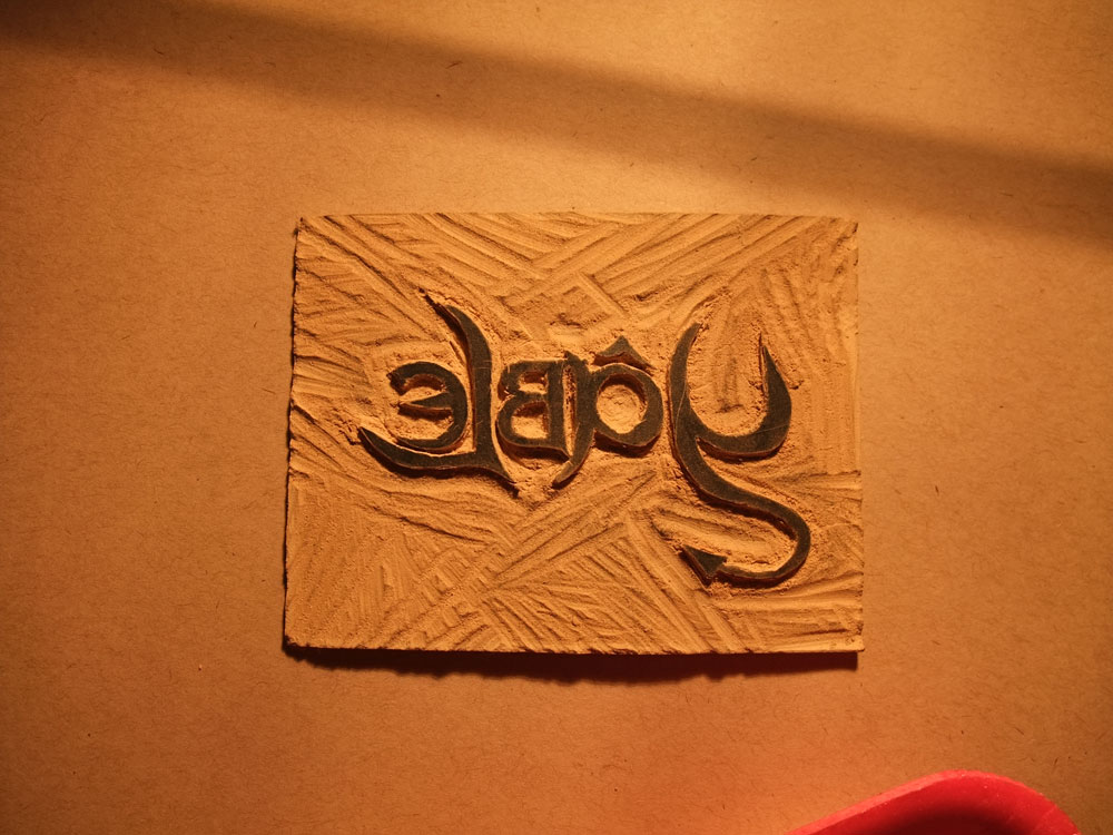
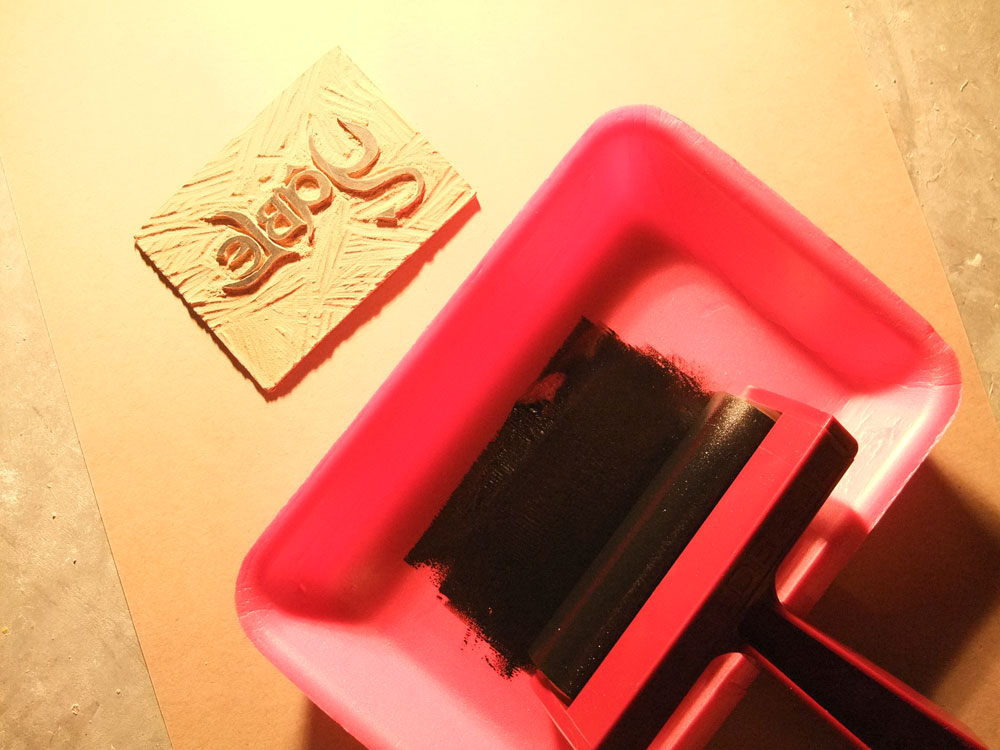
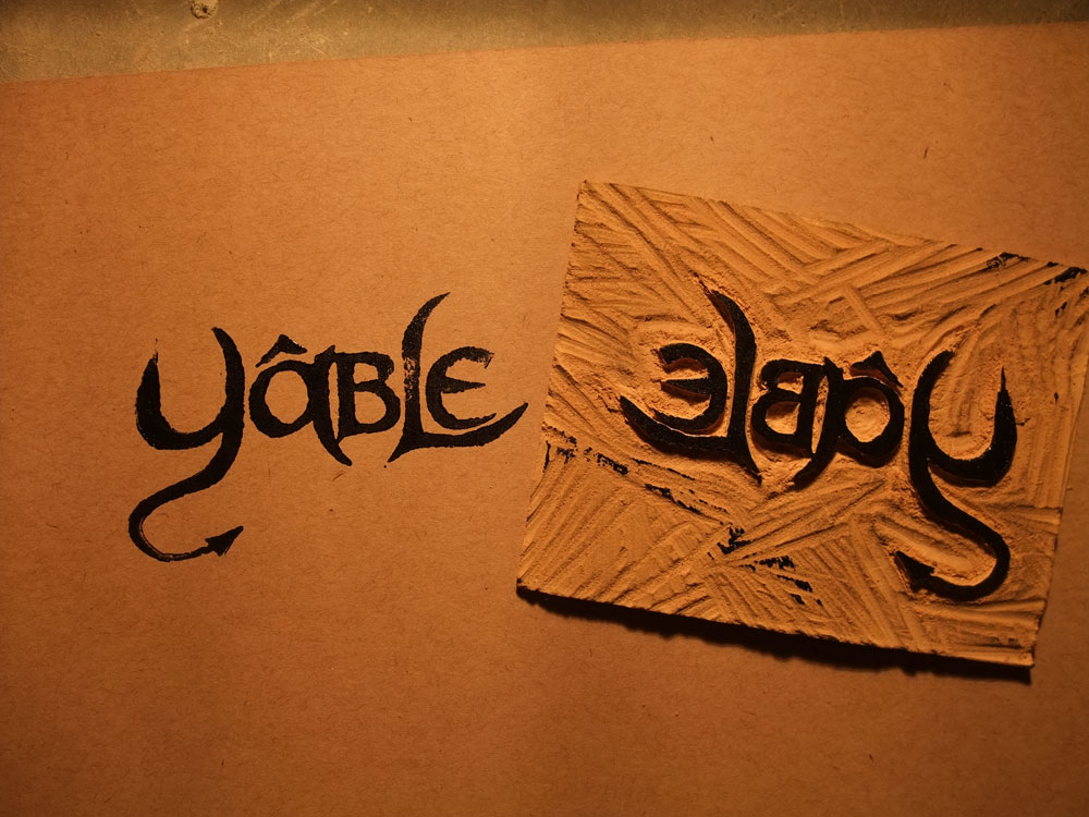
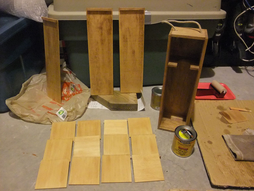
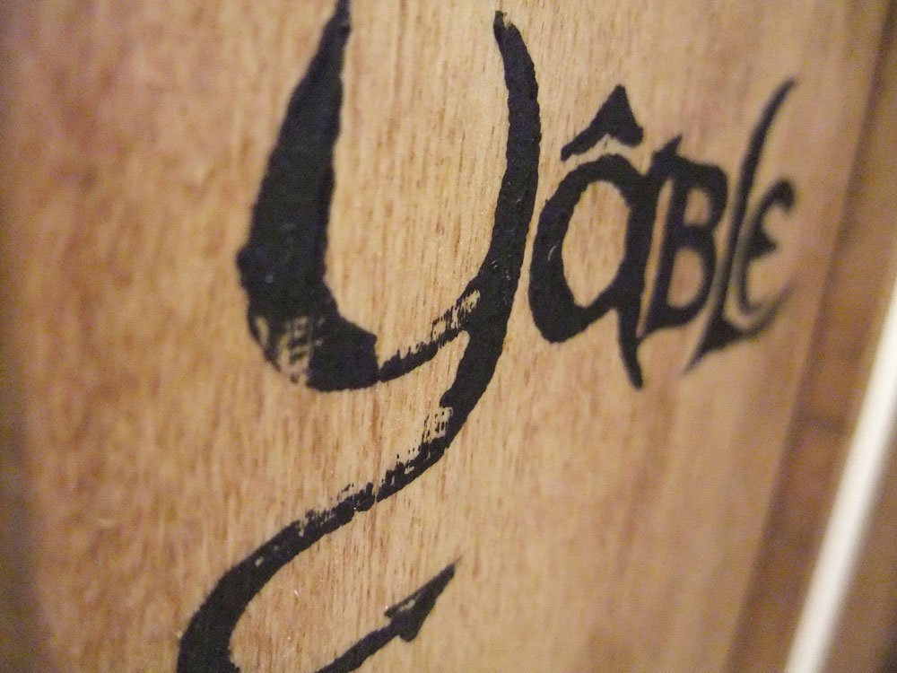
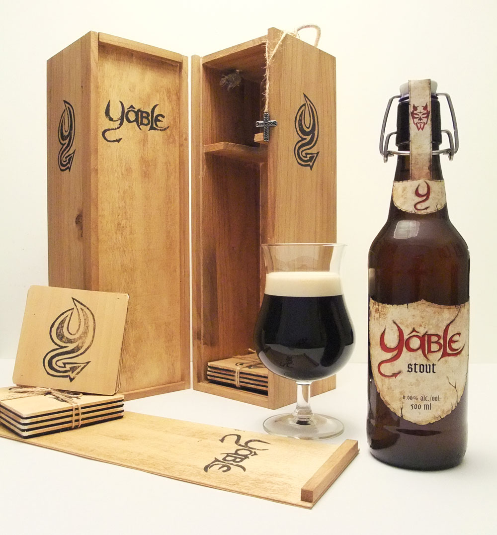
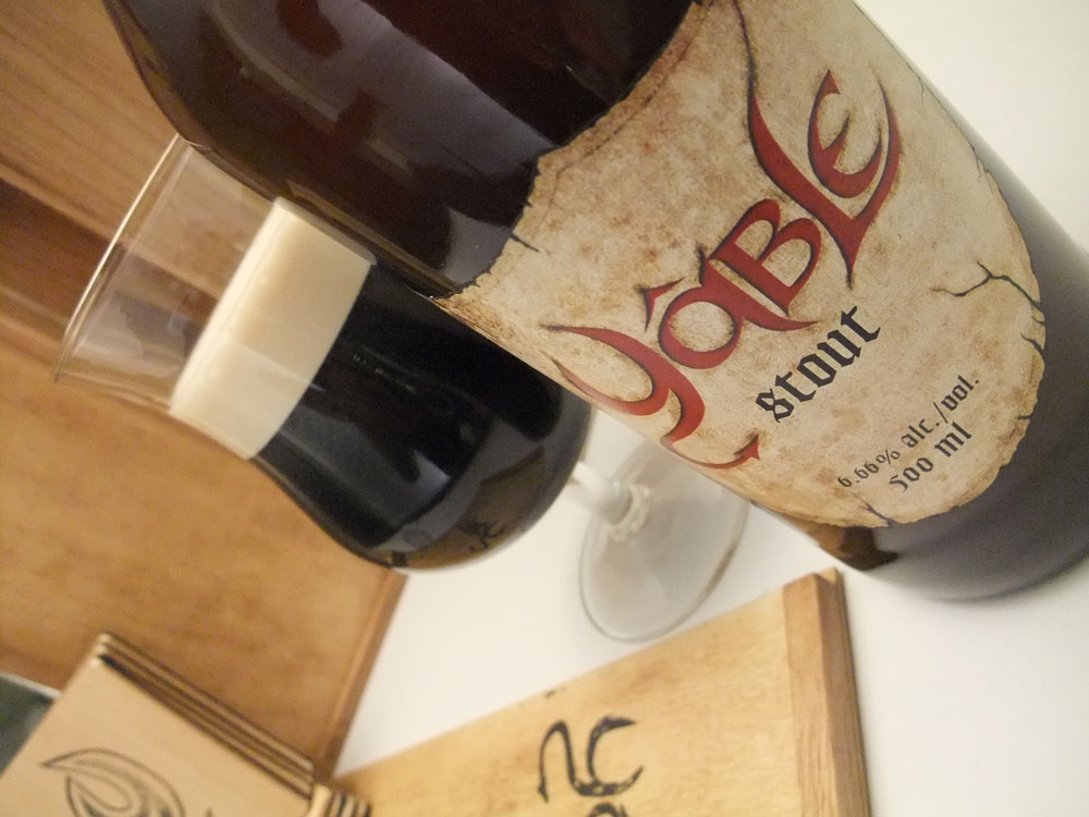
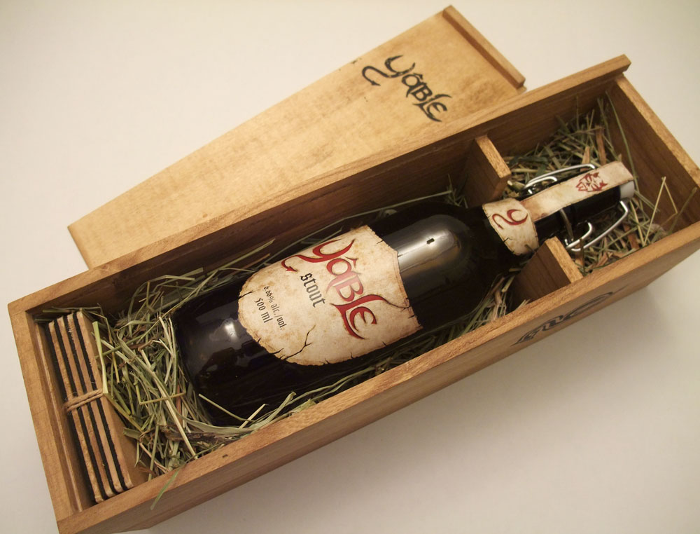
Time to be crafty. To convey the time period of the 1600-1700, I decided to use a wooden box as the packaging for the beer. Using this material recalls the days when alcohol was transported in wooden crates. Not only the packaging is made of traditional materials, but I used a manual printing technique to apply the logos on the box. So I had to carve out the word mark in reverse on a linoleum plate. A wood stain was applied to the inside and outside of the box and complementary coasters. This stain darkens the package and also gives emphasis on the wood grain giving the wood more character. A handmade packaging adds to the authenticity and tradition that the product is trying to convey.


copyright Dany Pepin 2011
School project S3 – Packaging and Die-Cut
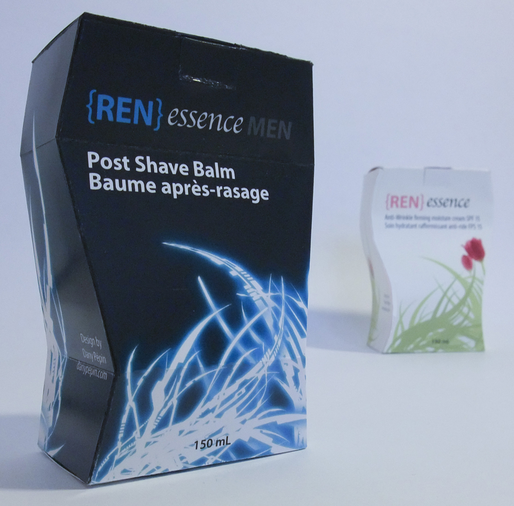
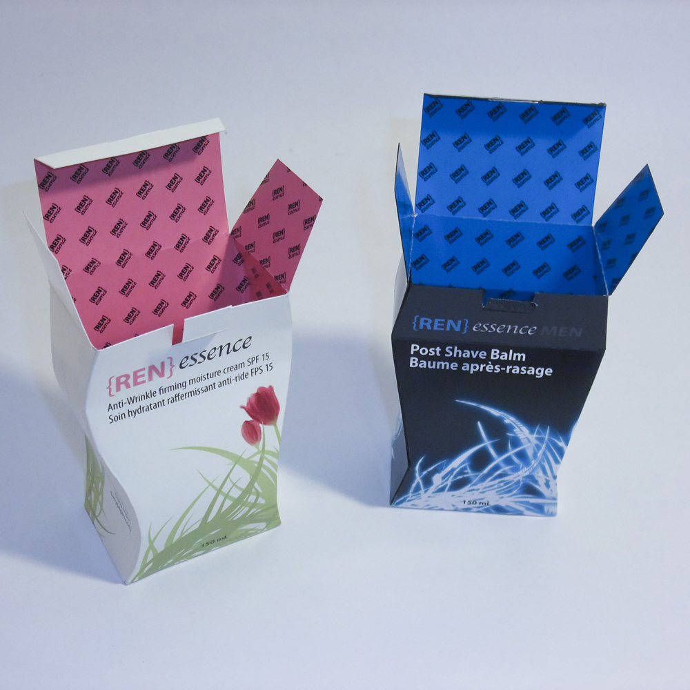
Last semester, I designed a simple box packaging for a brasillian papaya. This semester our task was to design a cosmetic product packaging for women or men. So to challenge myself and since this project was focused on die-cuts, I decided to create a uncommon shaped box for both women and men. I created a fake name « [REN]essence » playing with the word « Renaissance » which was appropriate for a anti-wrinkle cream (women) and a shaving balm (men) since it rejuvenate the skin.
The packaging for men is dark, robust with sharp angles and gives the impression of man’s silhouette. The addition of blue glowing blades is reminds the customer that this is a shaving product and gives a techno vibe to the product, something men are attracted to. The inside of the box is composed of the « [REN]essence » logo arranged in a simple pattern on a blue background.
The packaging for women is cream colored with smooth curves that also mimics the silhouette of the targeted customer. The addition of flowers and leaves gives away a feeling of rebirth and rejuvenation which is the purpose of the anti-wrinkle cream. The inside of the box is composed of the « [REN]essence » logo arranged in a simple pattern on a pink background.
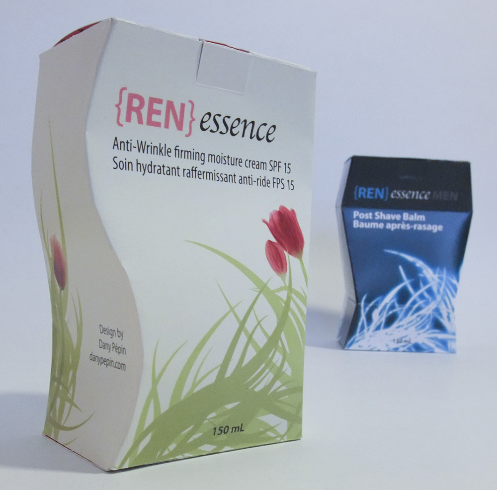
If you look carefully, the shapes and directions of the blades on the men’s product matches the leaves on the women product. This was designed to create unity between both product of the « [REN]essence » brand.
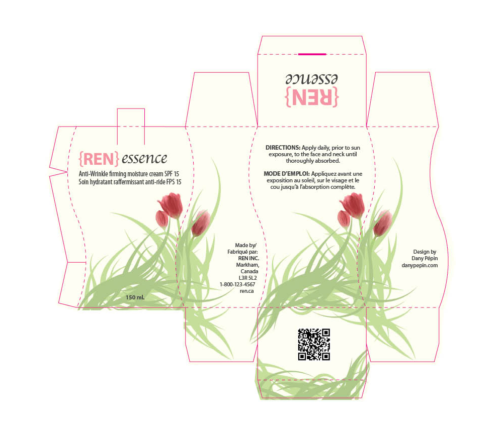
Finally, here are the boxes layout with bleed and die-cuts lines visible.

copyright 2010
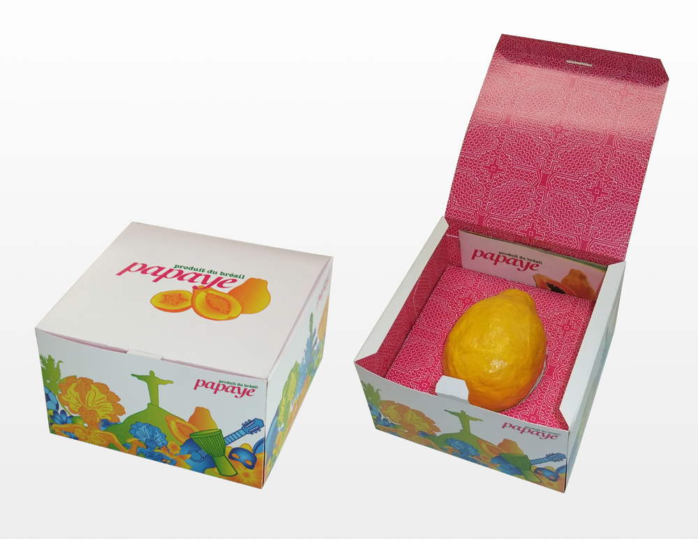
School Project S2 – Fruit gift-packaging
For this project we had to create a gift packaging based on the exotic fruit we’ve picked. I had the Red Amazon Papaya, and created a design inspired by Brazil.

copyright 2010
