School projet S6 : Radio-Canada/CBC Re-branding
This project involved a re-branding exercise of a Canadian public company. The development of the new brand extended to the research of the character of the brand, the style presentation (moodboard), the creation of the new logo and applications including a presentation book. The new brand has undergone an evolution rather than a transformation in order to maintain the reputation of this Crown corporation. Below are some images taken from the presentation book. The video moodboard (see article) and the details presentation book (7MB 42 pages) are available in french.
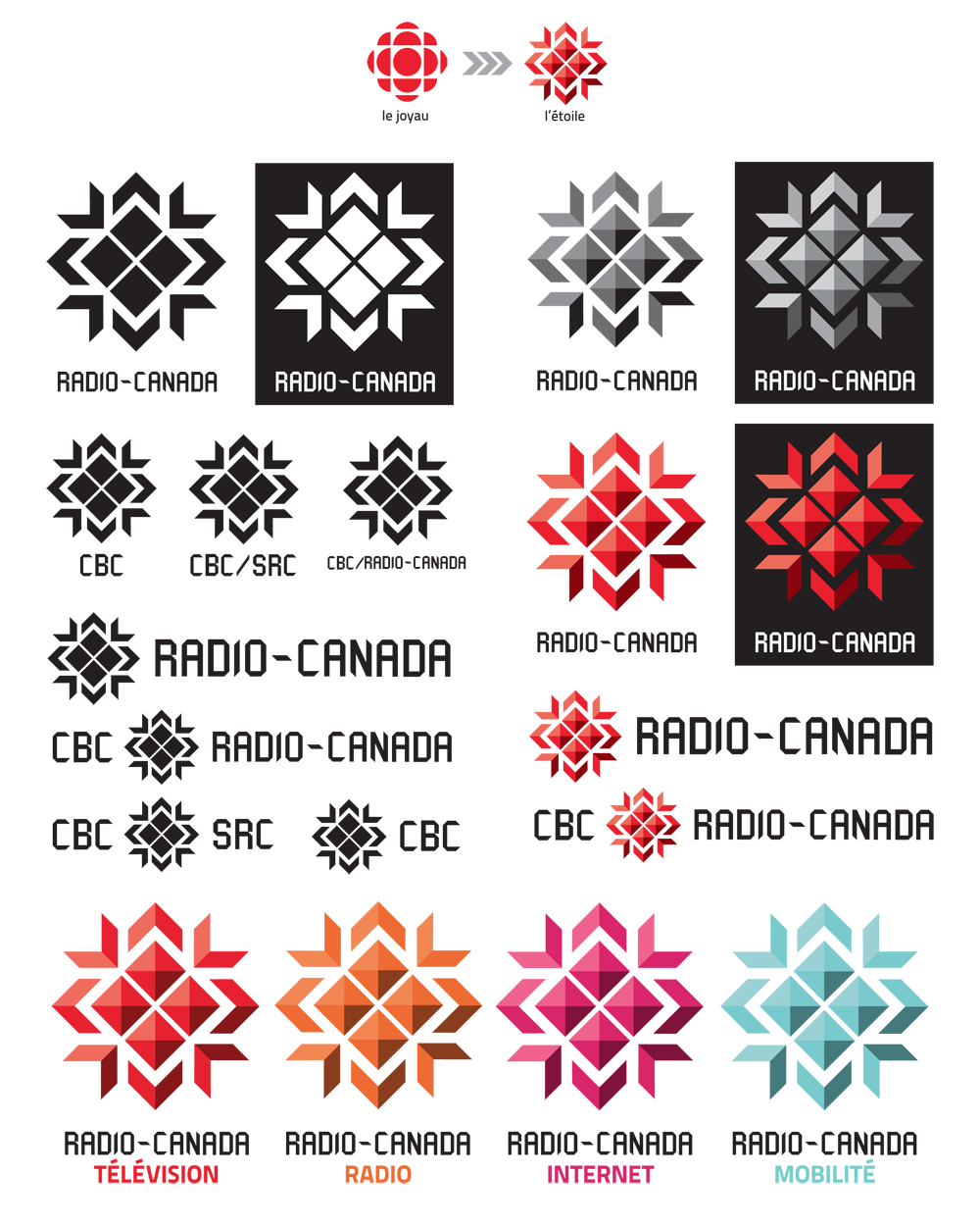


copyright Dany Pepin 2012
School project S5 – MIFO brochure
For this project, we had to create a artistic program/brochure for MIFO’s (Mouvement d’implication francophone d’Orléan) shows presented at the Shenkman Art Centre. It needed to be simple, clean, artistic and original. We had two comedians and four singers/songwriters to include in the brochure. The feature artist was Patrick Groulx since he was born in the region.
The cover features large typography elements with warm colors which is inviting to the audience. The typography also creates a bold contrast with the background. A picture of the Shenkman centre stairs is shown inside the letters for texture only. Offset contour lines were added around the letters to create movement and vibration. The background is a blend of the textures used inside the brochure. More on that later.
The back cover reminds us of the front cover. Big bold letters are use here as a focus point on the venue which is explain in the paragraphs on the right.


The idea behind this project was to have a progressive reveal of the artists. Since Patrick Groulx was the feature artist, we begin with him and the humour section. As you unfold the brochure, the artist are shown. A emphasis on the photography is important for the audience who quickly looks at the brochure. Diagonal lines create a more dynamic visual that recalls the Shenkman logo. The name of the artist has a similar style than the title on the cover and the information is simple and right to the point. The paragraphs also follow the diagonal. The background texture is specific to the sections. For the humour section, the background feature expressions like “LOL”, “hahaha”, “hihihi”, etc. The music section in composed of graphic and text representation of music notes.


Even if this wasn’t an “official” project, the students had to make a presentation in front of the class and the client (MIFO). Both the client and the teacher were evaluating each student presentation and brochure. My project, was chosen as one of the best overall.
copyright 2011
School Project S4- Photographer research
For this project we had to research an internationally known photographer and create a brochure/pamphlet about him for a fictional exposition. I chose Yann Arthus Bertrand who is mostly famous for his aerial photography. Having been a cartography specialist in my previous career, I’ve always been fascinated by aerial and satellite imagery which I was working with every day. That’s probably why his photographs caught my eyes. I had seen some of his photos at the book store without really knowing the artist behind the camera. I discovered a man who has always been passionate for adventure and nature. He wanted to immortalize amazing landscape mostly inaccessible to the general public. Living with nature has developed in him a bond which is now expressed in the environmentalist he has become.
He is mostly known for his book “Earth from above” and his free documentary “Home” (93 min).
You can see my brochure here. (drag the lower right corner to turn the page of the flash book)


copyright 2011
School project S3 – NAC Dance brochure
For this project we had to rethink the design of the existing dance brochure of the 2010-2011 season at the National Art Center in Ottawa.
The concept behind my dance brochure is an artistic metaphor between dance and painting. The dancers are the brushes that paint the canvas that is the stage. This metaphor is shown by the visuals of the booklet where dancers are integrated into the trace left by a brush stroke. Each brush stroke has been chosen to fully integrate the dancer and his movement. In addition, a separation line is also shown as a stroke on almost every page.
To contrast the artistic concept, a sans serif typeface was used (sometime vertically) to make the brochure a little more modern and corporate.
The cover attracts the eye by its tremendous movement, the word Dance in bright yellow and the 2010 numbers printed in metallic silver ink. The white space provides a balanced cover.


copyright 2010
School project S3 – Cité Femmes : applications
For the remainder of this project, we must develop various applications including stationary and business card using visual elements that emerge from the new identity created for “Cité Femmes”.
As for the logo, pastel color overlays and curved elements were reused for all applications. To strengthen the visual image, we added a female model wearing the colors of “Cité Femme” to give a human personality to the committee. Moreover, adding the slogan “Women’s safety on campus … we’re watching out for! “adds a sense of security and solidarity for women on campus.


copyright 2010
Blast from the past : Brochure
This was one of the two design projects I did for my previous employer before I had to be laid off because of the economy in 2008. You can see below the outside and inside of the brochure. This was fun to design, but as a Geomatic Specialist, this was very far from my appointed tasks which are described in the brochure. Now as design student, I see many flaws in this project.


copyright 2010
School project S1 – Satellites brochure
For this school project we had to pick a subject out of a hat and create a 12 pages brochures about that subject. I picked “satellites” which was very fitting since I’ve work in the earth observation field in my previous career. The image below only shows the cover and the first interior page where you can see the color dividers for each part of the brochure.

copyright 2009
School project S1 – Best Western folded brochure
For this project, we had to design a fictional brochure for the Best Western Hotel in downtown Quebec City. I decided to go out of the box and designed a half + letter fold brochure that would give a more modern image to the hotel and rival its neighbourhood competitors. The photo below doesn’t give credit to the final product.
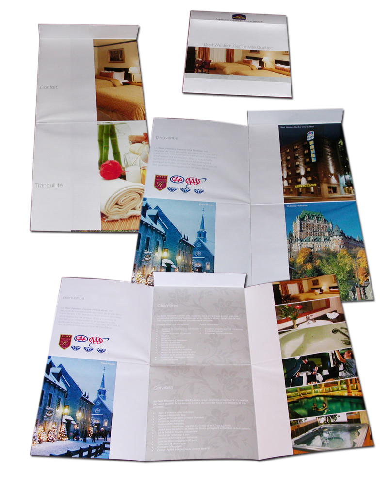
copyright 2009
School project S1 – Mer Bleu Folded Brochure
Mer Bleu is a conservation area south of Ottawa (Canada). It’s a large bog with an ecosystem more typical to the Artic than the Ottawa Valley. For this school project we had to create a bilingual folded brochure to promote Mer Bleu using photos taken on site and an imposed text.


copyright 2009
