School project S6 – Aids initiative poster
This poster project was targeting another social awareness subject: Aids. The objective was to promote the Federal government initiative to fight against HIV / AIDS in Canada. This initiative provides funding for different prevention and support programs.
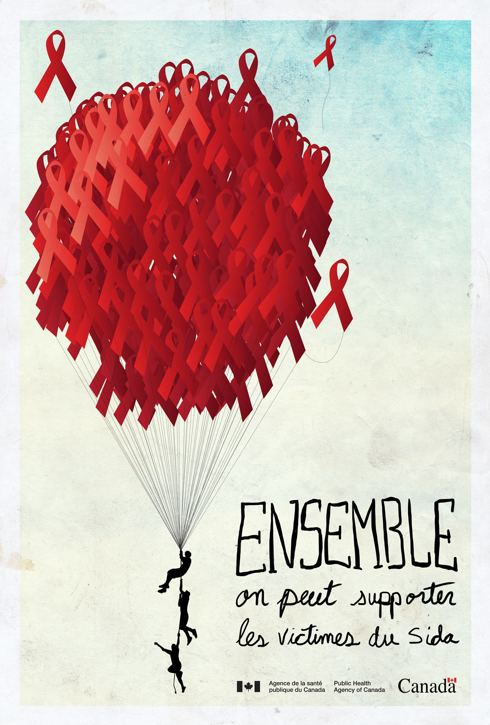
The first poster symbolizes all the support given by the population and AIDS programs. A group of red ribbons forming a balloon supports the AIDS victims. The hand-written words “Together we can support AIDS victims” ties with the poster’s visuals.
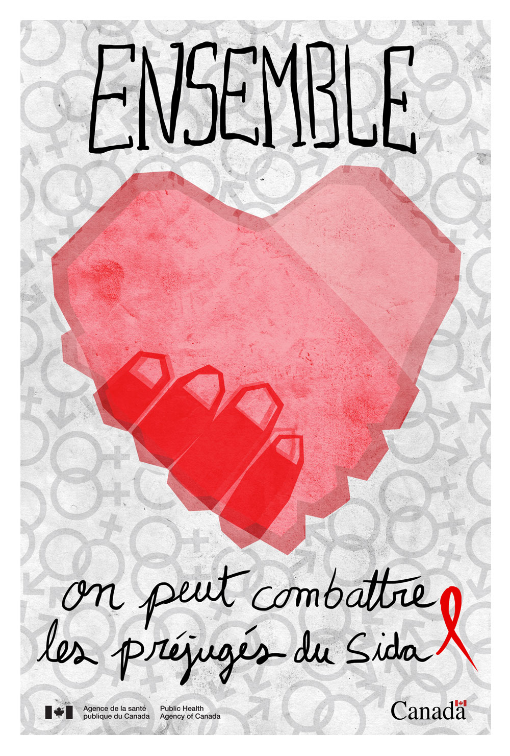
This poster is one of a series of three. Two hands holding in the shape of a heart with a mosaic of symbols in the background representing heterosexual and gay couples. The hand-written word “Together we can fight the prejudice of AIDS” ties again with the support given by the different AIDS programs and the population.
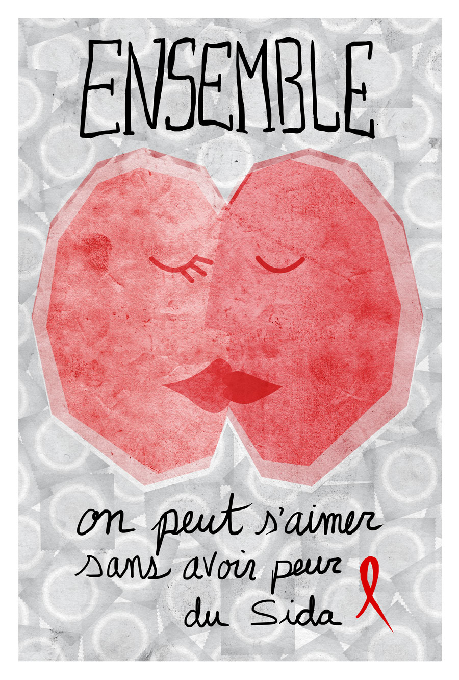

This poster was not submitted because it didn’t tie well with the government initiative. Nevertheless, I posted it because I liked the idea.

All the posters below were abandoned ideas and work-in-progress.


copyright Dany Pepin 2012
School project S4 – Book illustration
For this project we had to pick one of 4 classic tales (Little Red Riding Hood, Puss in Boots, Hansel & Gretel, the Three Little Pigs) and create a modern interpretation of the story. Since we didn’t have to stick to the original age group the story was written for, I decided to tell the tale of “Red Riding Hood” for an adult audience in the form of graphic novel. You’ll notice my inspiration from Frank Miller’s “Sin City” graphic novel where everything is in black and white with a touch of color. This color contrast created by the light and shadow offers a dramatic and mysterious setting, perfect for a tale with sexuality and explicit violence. My sketches were very explicit so since this was a school project, I had to tone down the illustrations by changing the viewing angles.
The story isn’t complete since we had a limited number of page to illustrate. But you’ll get the idea even if the text is in french.
Click here to see the flash book (drag the lower right corner to turn the page) or look at the PDF for full resolution. (WARNING : For adult only)

copyright 2011
School projet S4: Editorial Illustration
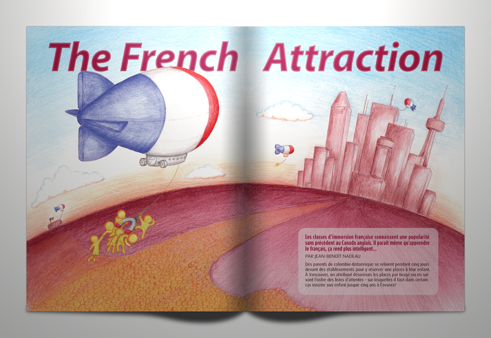
For this project we had to create an editorial illustration based on a random magazine article provided by the teacher. We then had to include this illustration in a spread layout. My article, called “French Attraction”, depicts the recent popularity of French schools in the English community of Canada. French being the second official language in Canada, being bilingual open a lot of opportunities in the workplace. My illustration shows a fictional city (mix of Montréal, Toronto and Vancouver) in the distance with a see of people lined up and seeking a job opportunity. The bilingual people, having an advantage over the others, are carried by “French” blimps over the crowd and directly to good careers high up the skyscrapers. The addition of a magnet holding the characters is a simple reference to the title. The illustration was made with color crayon and the layout in Indesign.
copyright 2011
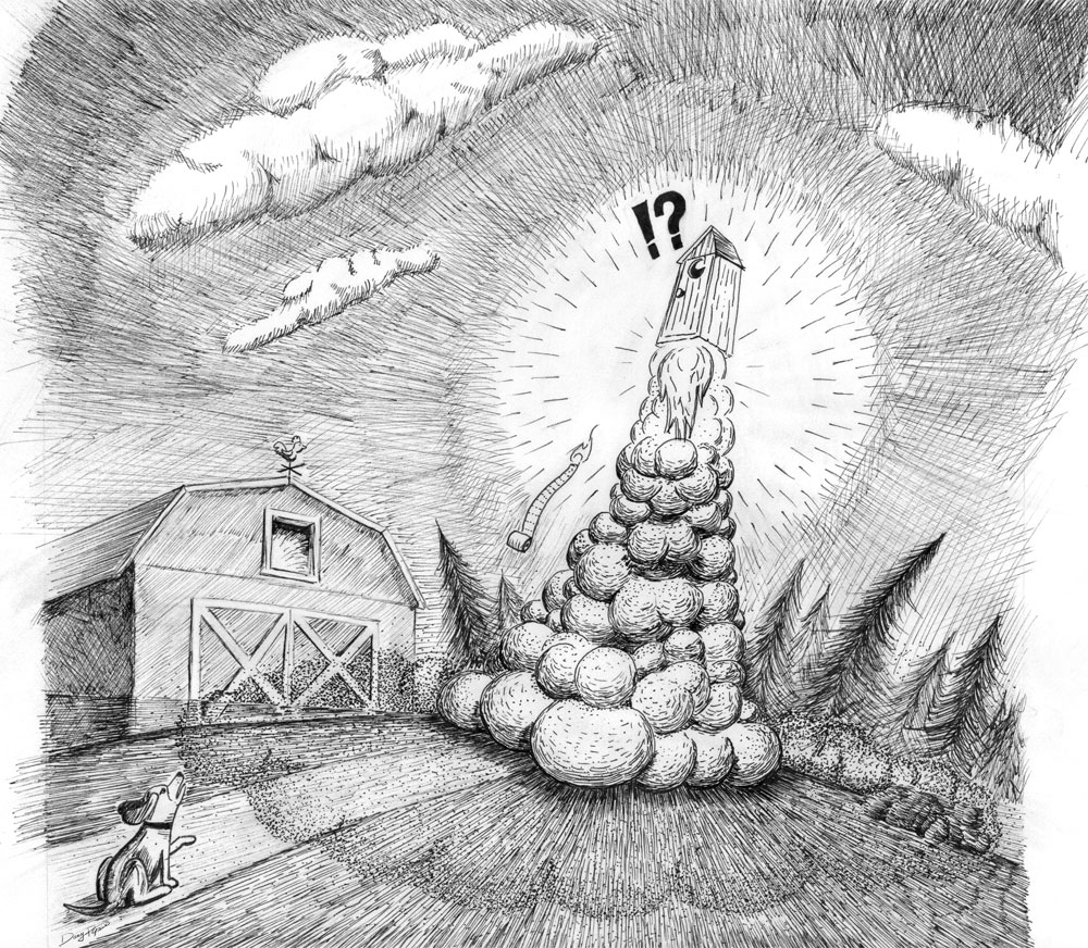
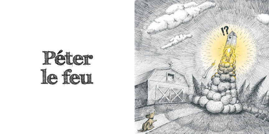
School project S4 – Idiom illustration
For this project we had to pick a french idiom from a list and create a black and white illustration portraying the expression. We had to use dots and lines for shading. Colors, with the exception gray, were allowed but only to add some impact to the illustration. I picked the french idiom “Péter le feu” (farting fire) which basically mean “being full of energy”.
copyright 2011
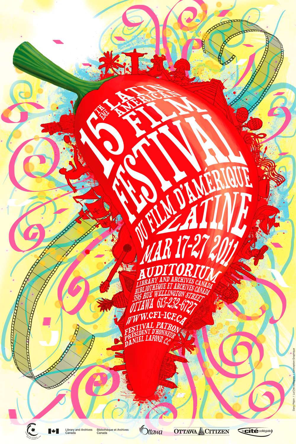
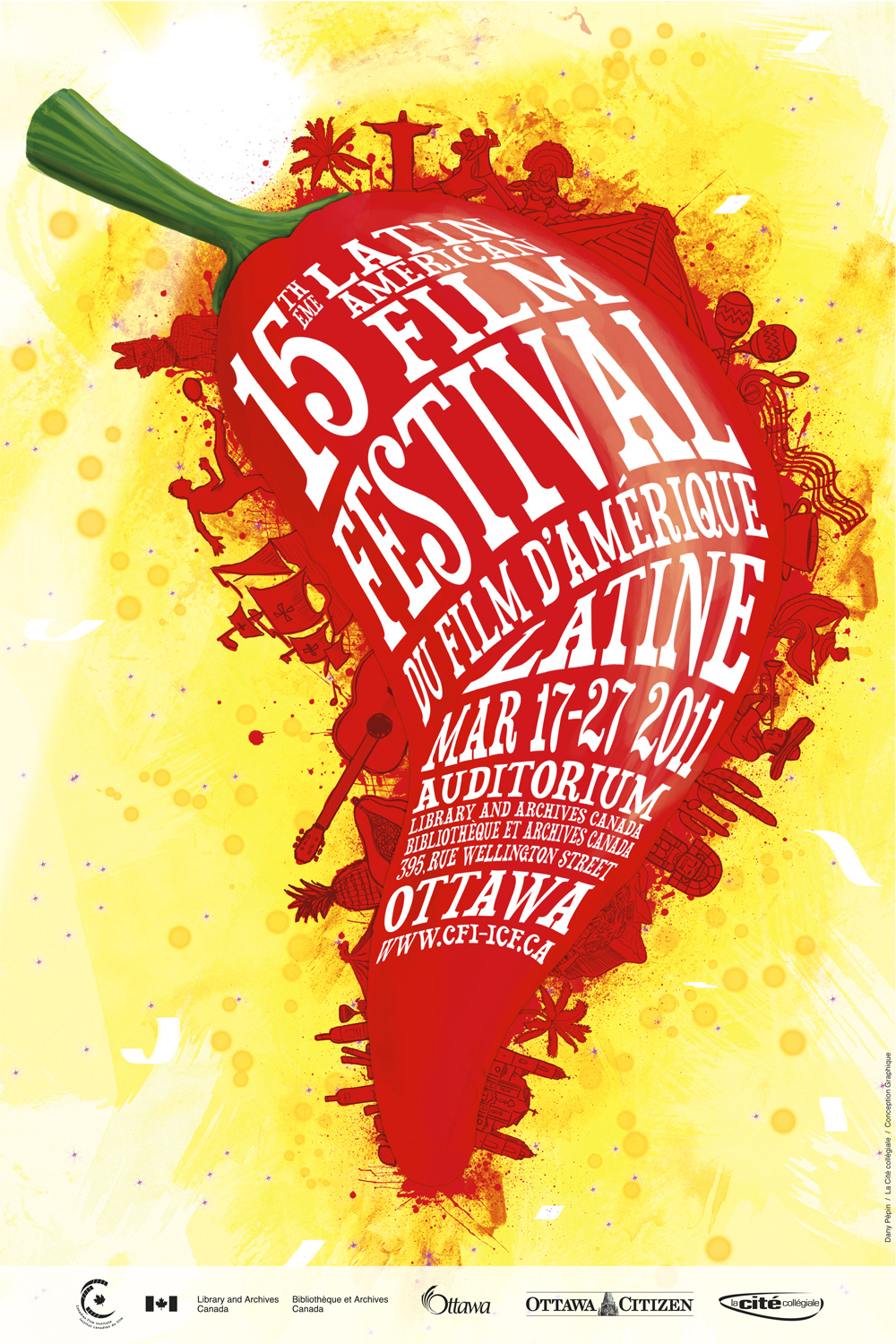
School project S4 – LAFF poster
For this illustration project, we had to create a poster for a real client, The Latin American Film Festival in Ottawa (March 17-27 2011). My poster won the competition and will be posted all over the city.
My concept behind the poster was to feature Latin America and its culture. I chose a hot pepper as the focus of this piece because it symbolizes the strength and the warmth of it people and because its shape can resemble the South-American continent. From a good distance you only see a pepper with text wrapped around it, but those who will look closely will be able to see all the culture elements (art, history, entertainment, etc.) surrounding it. Since the Latin American culture is colorful and festive, I added some ribbons on a bright yellow background, which creates contrast. The left image below is the original illustration while the right image is the edited version has with the client modifications.
copyright 2011
School project S3 – Christmas pop-up card
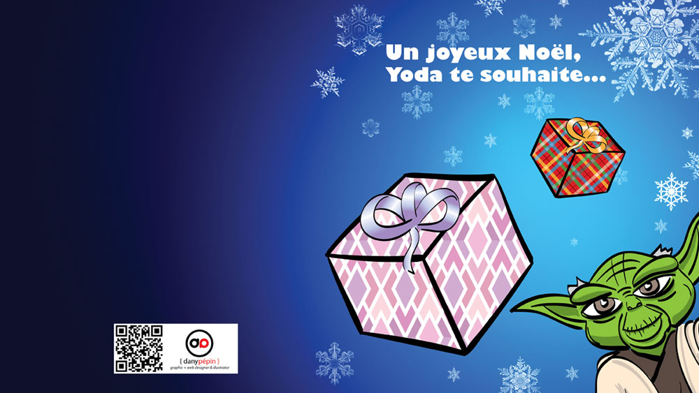
For this project, we had to design a pop-up christmas card. I decided to make it a Star Wars card since I’m a big fan. The card shows Yoda balancing gifts over is head with the Force. R2-D2 and C3P-O are looking at the Jedi Master from the side.
I must admit, I didn’t think this project would be as difficult as it was. I had to make numerous dummy card (blank) to have the different angles of the cutouts fold perfectly along with the card. This was also a fun project since I illustrated all the graphics of the card by hand with my Wacom tablet and Adobe Illustrator (see yoda below). I don’t know if I ever want to create another pop-up card again, but I have a lot more respect for the likes of Matthew Reinhart who are geniuses at this art.

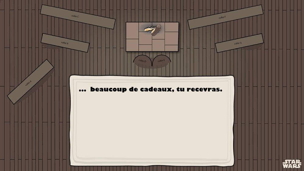
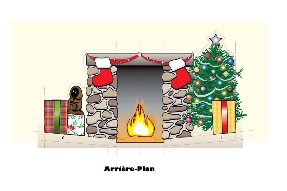
If you are interested in doing this christmas card, I made the full resolution (300 dpi) PDFs available here and here. The PDFs don’t contain the die-cut lines (blue and pink), but the reference images below do. Follow the dotted lines to fold and the plain line to cut. You can also use the video above as a reference. The size of the card is 8×9 inches (closed) so you might want to scale it down if you want to use your home printer. If you want to recreate the full size card, I suggest you use a thicker paper stock than usual because the cutout are fairly big and will collapse under their weight. Your local “Staples” should be able the printout those 12×18 files. (Note: the cutout files fit on a 11×17″ sheet). Good luck.

copyright 2010
School project S3 – Board game
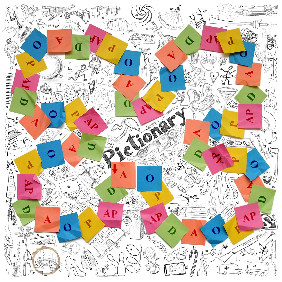
For this illustration project we had to pick an existing board game and make it more interesting. We had the choice between, Clue, Monopoly, Pay Day, Risk, Snakes and Ladders, Scrabble, Trivial Pursuit and Pictionary. I chose the latter, because the original board game had a very simple design.

My idea was to create a board full of doodles and illustrations that could be used in certain cases during gameplay or just to add some fun. I wanted the board to look like an actual game of pictionary, not a boring path of aligned squares on a dark background. I decided to make the path of squares as real post-it notes since you are always drawing on little pieces of paper. I even included a coffee stain to make the illusion more convincing, as if you were playing on a table make out of doodles. To create contrast, I kept the original letters (categories) on blank colored squares to make sure the path didn’t compete with the white doodle background. Each of the 104 illustrations have been numbered and the answer sheet is available for player. I’m sure you can guess most of them. Click on the image below for a closer look.
copyright 2010
School project S3 – Sports Movement study
For this project we had to show movement and exaggeration to a certain degree in a sport related illustration. The illustration format was predetermined, it needed to have the word “Nike, Play.” and the athlete needed to touch 3 sides of the images. Also, any motorsports and the use of a background was prohibited. Out of all the sketches of different sports I showed the teacher, he wanted me to do cycling. Not an easy task to show movement in a sport where the athlete is always constrained to his bicycle. On top of that, he wanted me to go out of the box and try a technique I didn’t even know about, “scratchboard” (working from all black and scratching out to show white). I used Corel painter 11 with my Wacom tablet and added color with photoshop. I’m happy with the result (below). You can see the cyclist focused, clenching his handlebars, raised off his seat and pumping hard to climb a hill. Movement is also shown in the wheels circular scratches.
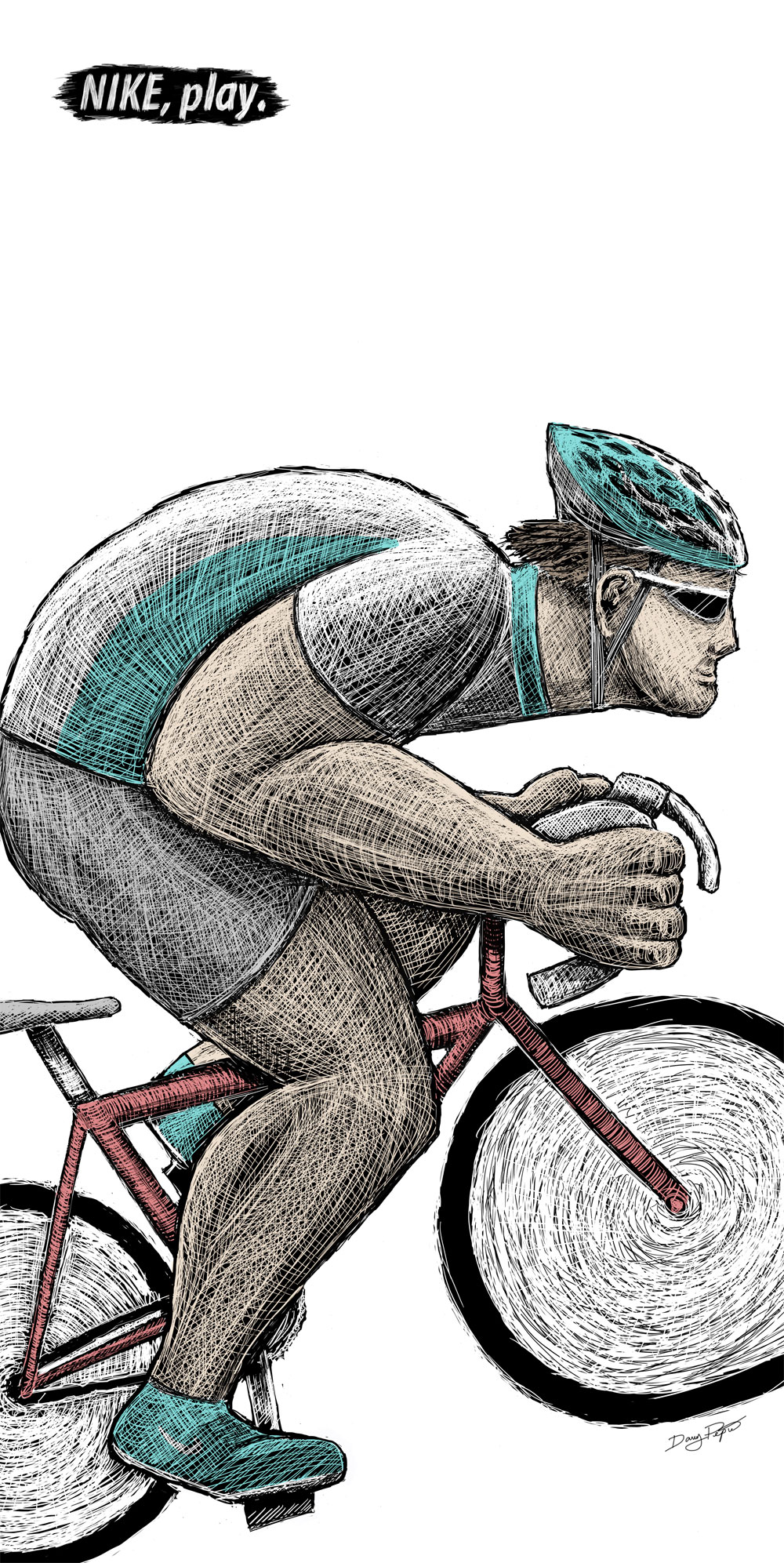
copyright 2010
School project S3 – Movie poster
For this illustration project, we had to create a movie poster without using any of the characters or actors of that particular movie. I chose the classic horror movie The Shining from the list of predetermined movies provided by the teacher. The poster shows the front of Danny’s tricycle stopped in front of a pool of blood. If you’ve seen the movie you’ll know which scene it represents. The association of a young kid and blood is disturbing and that was the objective of this poster… create an interest. To make it darker and creepier, I added a shade of green over the entire painting and desaturated the colors. The first version (left) was the poster submitted for grading while the second version with the shadow (right) was a bit too busy for my taste. Again, this digital illustration was handpainted in photoshop with a Wacom tablet.
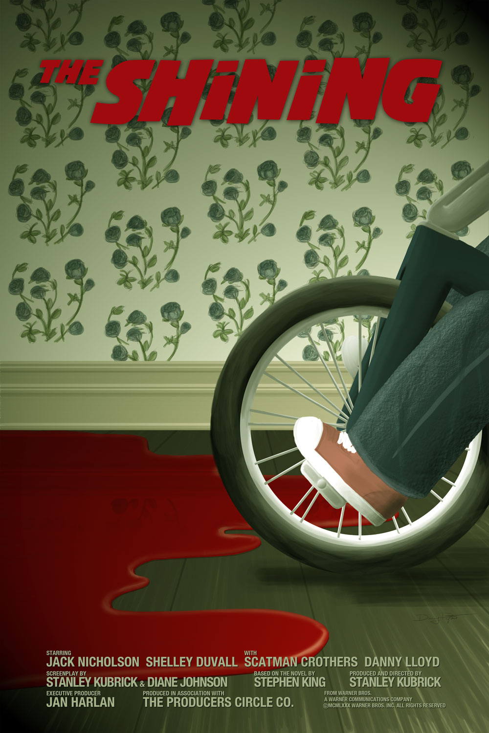

copyright 2010
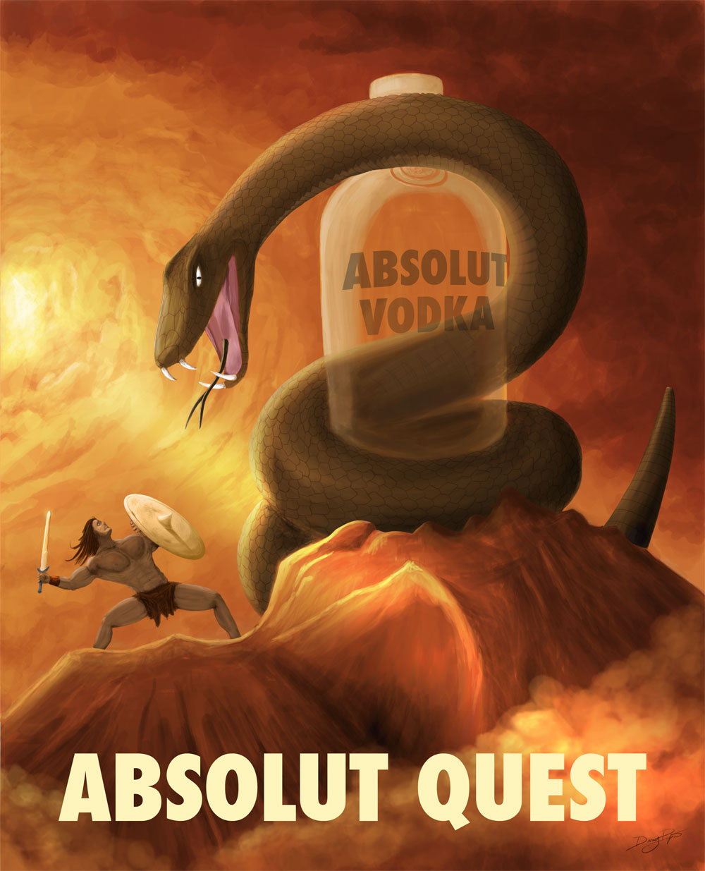
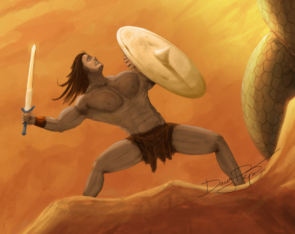
School project S3 – Absolut Vodka Ad
For this project we had to make a fake Absolut Vodka ad, in the style of one of our favorite illustrator. We didn’t know about the project when our teacher ask each student two pick two of their favorite illustrators and show the class some of the work they do. I my case, I had chosen Drew Struzan and Frank Frazetta. Then, he announced that we had to make an Absolut Vodka ad in the style of one of our two chosen illustrators. That was a surprise, and I might not have picked those two illustrators/painters because they do highly detailed work. I picked Frank Frazetta because I’m a fan of his Conan book covers. The final result is my best illustrative work ever. This digital painting was done entirely in photoshop with a Wacom tablet and took me around 22 hours to complete. If you are curious, you can see the “making of” videos by following this link. The title Absolut Quest stand for the challenge Conan faces to get to the Absolut Vodka bottle protected by a giant snake.

copyright 2010
