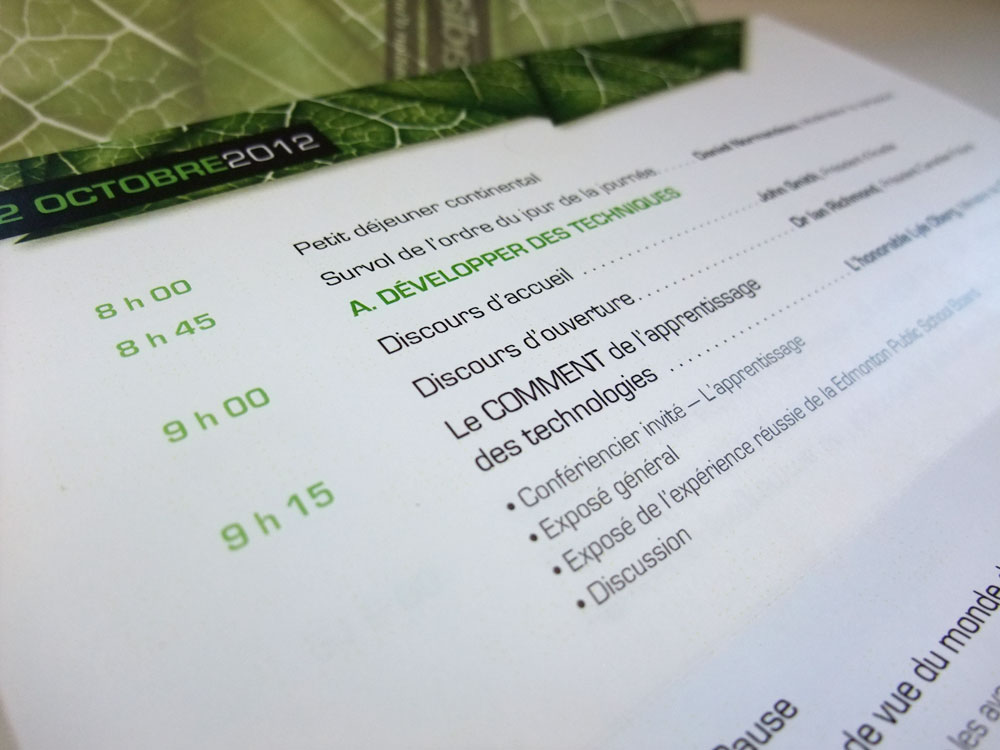
School project S6 – The 2012 Student Exhibition
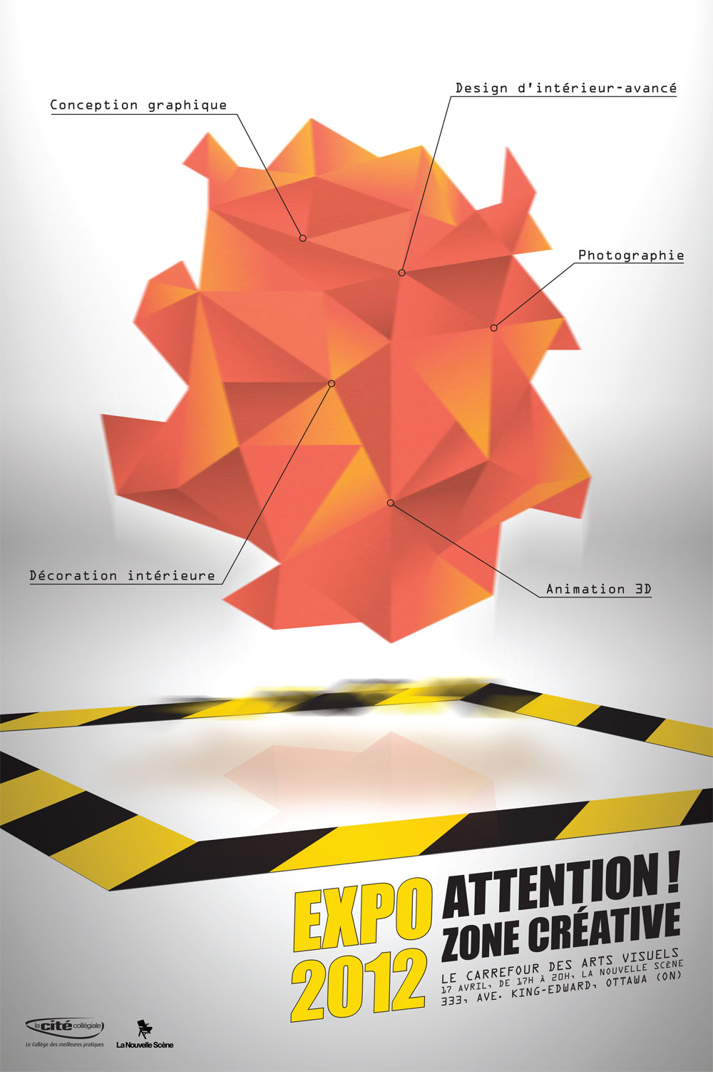
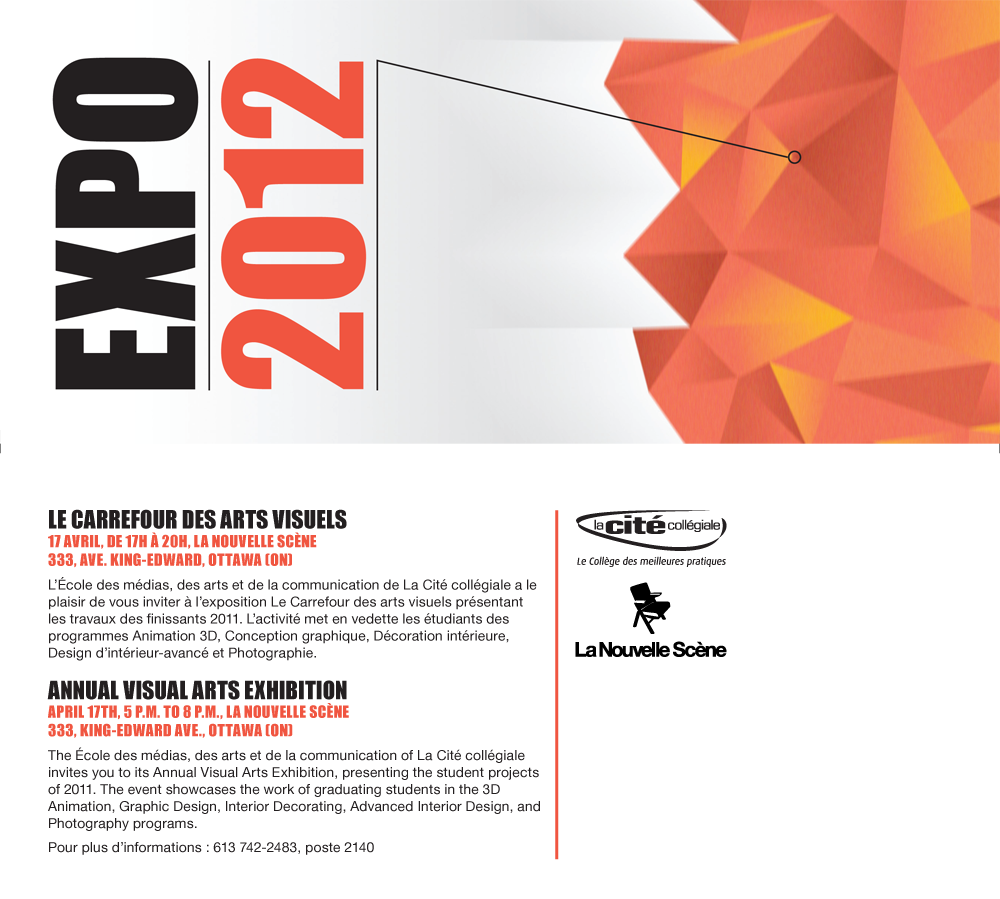
Each year for this project, graduating students need to create a poster, a directional sign and an invitation for the graphic design student exhibition. This year the tag line of the expo was “Warning: Creative Zone“, so we had to design our applications around this idea and include the 2012 color: Tangerine Tango. Lots of cool designs were created and three finalists were chosen. My design, which finished 3rd, represent a vibrating mass of creativity hovering inside a closed perimeter. I made the orange mass as alienish as possible. You can almost see it moving and transforming itself. The student exhibition will take place April 17th from 5PM to 8PM at La Nouvelle Scène in Ottawa (333 King-Edward ave.).

copyright Dany Pepin 2012
School project S5 – Exposition visual signature
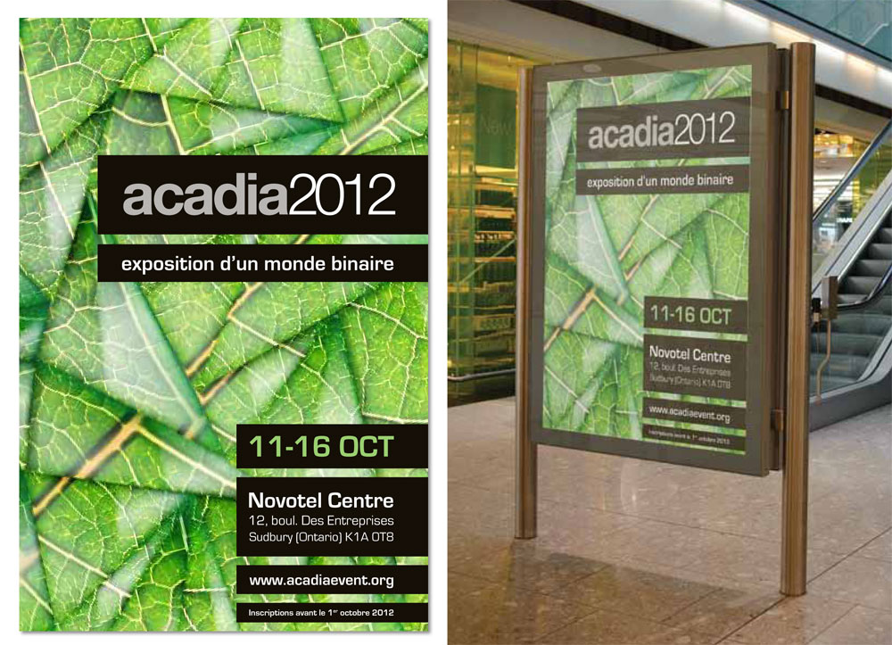
The mandate for this project was to design the graphic signature of the Acadia 2012 exposition. Acadia is an organization that is committed to the research and development of computer aides that enhance design creativity, rather than simply production, and that aim at contributing to the construction of humane physical environments. It promotes fusion of technology and nature.
This project allowed us to work in teams. I allied myself with one of the best student in my class and a close friend, the wonderful Katherine Proulx. We wanted to work together for a long time because of our individual success and our excellent chemistry when it comes to design and brainstorming.
The project required that we design a poster, directional banners, an invitation card, a program and an uncommon display element with the same visual signature. On top of that we needed to present our design in front of a panel composed of the teacher and two communication specialists. This was a huge task for the time we had. The explanation below is similar to what we presented to the panel of experts. The presentation was mimicking the order in which a potential visitor would meet these graphic applications in real life.
![]()
The concept
Knowing what the Acadia organization stands for, we developed a concept around what we find to be the most natural of things…the ground beneath our feet. But more specifically around the smallest element representing the ground … a grain of sand. This opaque grain of sand has been transformed into glass and is now a reflection of the technology. Glass is the thing that separates us from technology the most. Your computer screen, your TV, your smartphone and your tablet are all technologies which information reaches you in the form of light rays through the glass. In the past, you had to set foot on the ground and walk a long distance to communicate with another person. Now, the same ground carries your communications as binary pulses of light through the glass of fiber optics. Light going through glass is also a symbol of innovation and creativity … the light bulb.
“A grain of sand is the reflexion of today’s technology”
Katherine & Dany
As pixels of an image, the assembly of several small elements forms a distinctive whole. We have strengthened the association with nature by representing a leaf, which is an easily recognizable. The leaf is formed by each small triangular piece of glass that refracts the light in different ways. Every person on earth has a different vision of what nature is today and this is what each individual piece of glass represent. Only a collective effort with technology will standardize the overall vision of nature.
In addition to the visual concept, the assembly of these pieces of glass is an abstract work of art in itself, as are many projects submitted to the Acadia competition.

The poster
The poster takes the concept explained above for the background, but we used a close-up of the glass mosaic rather than the full leaf. The veins are sufficient to understand that this is a leaf. This prevent the audience from seeing the shape of a simple leaf from afar. Furthermore, the use of the full-page mosaic offers an interesting texture that attracted attention for its vibrant green color. The information is arranged on black stripes reminiscent of a “bar code” an provides an excellent contrast with the background and maximum visibility. The text uses a font very visible to help readability. The poster could be printed on a translucent surface and applied to windows or light boxes. The light passing through the display increases the concept of glass.
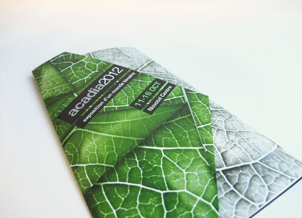
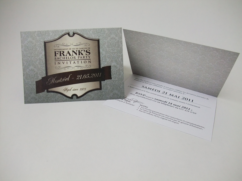
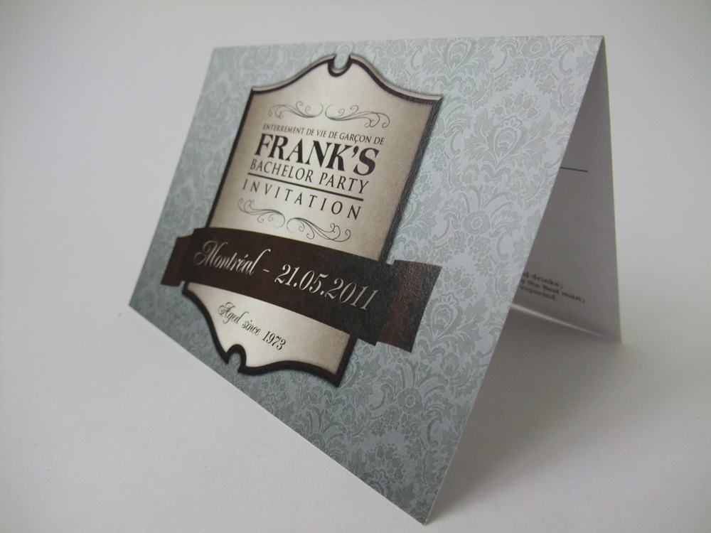
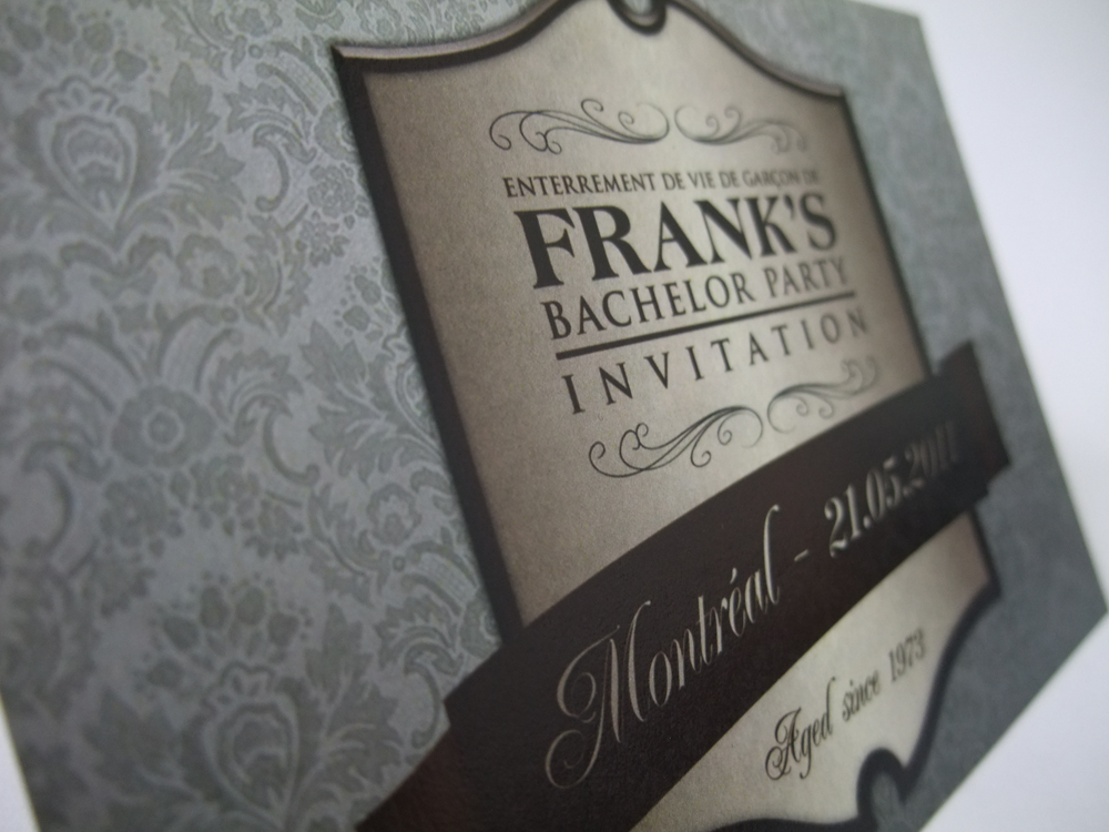
The invitation
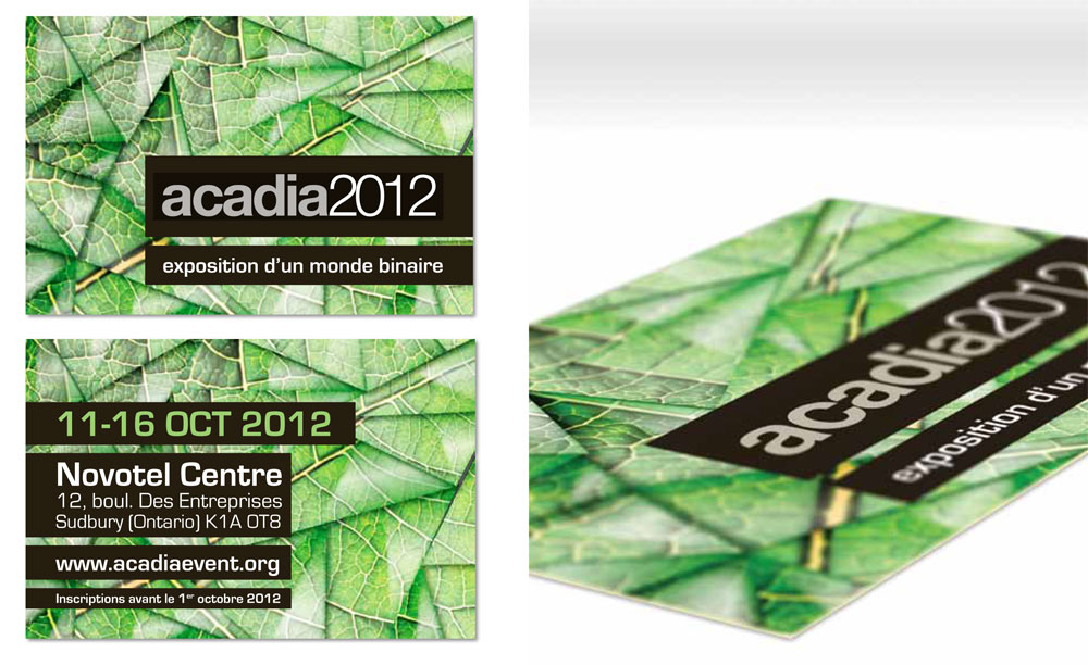
Our potential visitor first receives the invitation. This 5×7 in. invitation contains the glass mosaic in the background on both sides. On the front we find the name of the event and the title of the exhibition. The back shows all the information with an emphasis on the date that is visible on longest black line. This format is easy to carry and can also be used as a flyer.
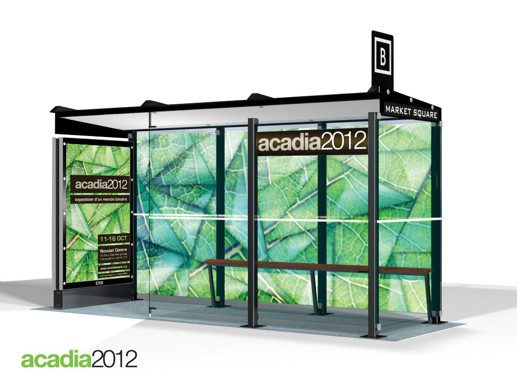
The bus shelter
Our potential visitor is now interested in attending this event. He decides to take public transit to get to the convention center since he has an environmental awareness. He therefore takes the bus and arrives at the Novotel Centre bus stop.
The bus stop has been dressed with the graphic signature of the event. To explain the composition of the shelter, we show you in two phases (see images below). First, the three back panels shows the glass mosaic that has been printed on a transparent adhesive in order to let the light through. The poster is affixed to the inside and outside of the side light box. Secondly, the remaining glass panels have received a seamless application that mimics the triangles of the mosaic, but without the leaf pattern. Each triangular piece has a variable thickness resulting in a refraction effect of the image passing through it. This allows the bus users to see their bus coming, but also allows them to see the surrounding environment in a quite different way. This out-of-the-ordinary application is the highlight of the outdoor advertising because of its originality and visibility.

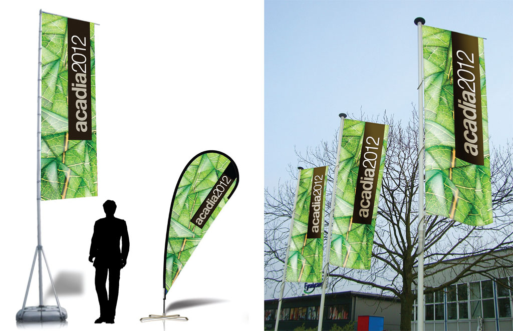
The directional banners
After disembarking the bus, our visitor must find his way to the entrance. Nothing could be simpler. He only has to follow the directional banners.
There are two types of banner signs. The first type of banner is rectangular. It overlooks the ground from a height of 18 feet and strewn the perimeter of the Novotel Centre property at regular intervals. The second type of banner has a shaped curve, a height of 10 feet and guides visitors from the different entrances to the main gate by marking a path. Some banners of this second type can also be used indoors. The banners also uses the original graphic signature and shows only the name of the event. A third type of sign, not shown here, consists of several small triangles as seen on the mosaic. They are individually affixed to the floor of the convention center and create a path from the main entrance to the reception booth.
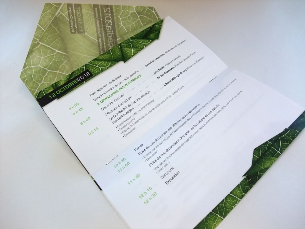
The event program
On arrival at the reception booth, our visitor shows his invitation to the attendant and then receives the event program.
The event program has a dimension of 3.75 x 7 inches and is printed in two colors (Duotone). The front cover is deployed as a letter fold pamphlet to reveal the word from the President and the calendar in a separate saddle-stitch section. The leaf mosaic is used on the cover in colour over a black and white background. The triangular part of the cover, which simulate transparency, is also used as a bookmark for the calendar. The calendar section is inserted vertically in the pamphlet and each spread shows the schedule of one particular day. Having one spread per day lets the schedule breathe and keeps the readability to a maximum.


The presentation
Finally, our presentation went extremely well and we impressed every members of the panel by our preparation, our professionalism and our attention to details. They loved the program, the situation scenario in which we presented pour graphic element and the small presentation brochure we handed them to help follow our explanations. Katherine and I were told that even professionals rarely match a pitch like we just had done. We nailed it!
copyright Dany Pepin & Katherine Proulx 2011
Classy Bachelor Party Invitation
My brother is getting married in July and as his Best Man I had to organize the bachelor party. Since it is an italian wedding, lots of family members were invited to a dinner that would start the evening. To make it more official, I created an invitation that reflect the whisky lover my brother is. I designed a simple crest/whisky label and put it in front of a classic pattern. The result is quite good, but the most important thing is that my brother loved it!
copyright 2011
