School Project S3 – Restaurant menu
For this project we had to design the evening menu of a French cuisine restaurant called “Le Tartuffe” including the revitalization of the logo. Below is the design study of the menu with the final result at the end.
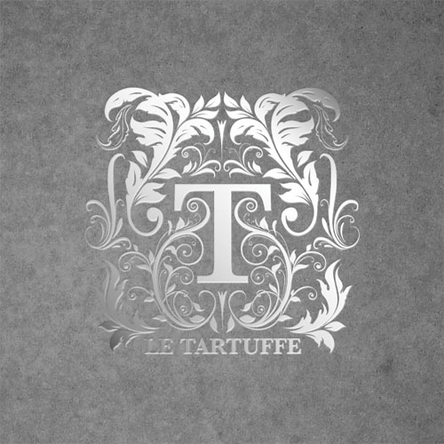
Evening Menu “Le Tartuffe” – The Logo
Theses two logos are inspired by the era of Louis XIV (Rococo), the same where Molière’s play “Tartuffe” was written and performed for the first time. Many floral and decorative elements reminiscent of the “rocailles” adorn the restaurant’s new signature typography.
![]()
![]()
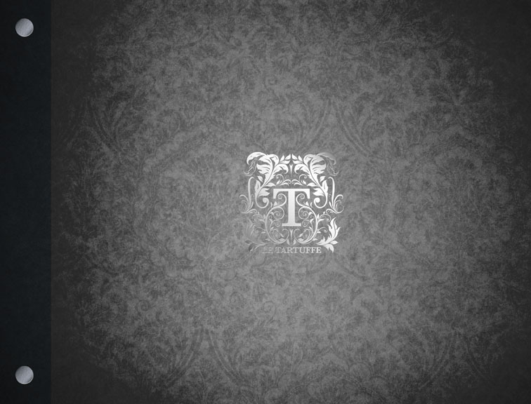
Evening Menu “Le Tartuffe” – The Logo treatment
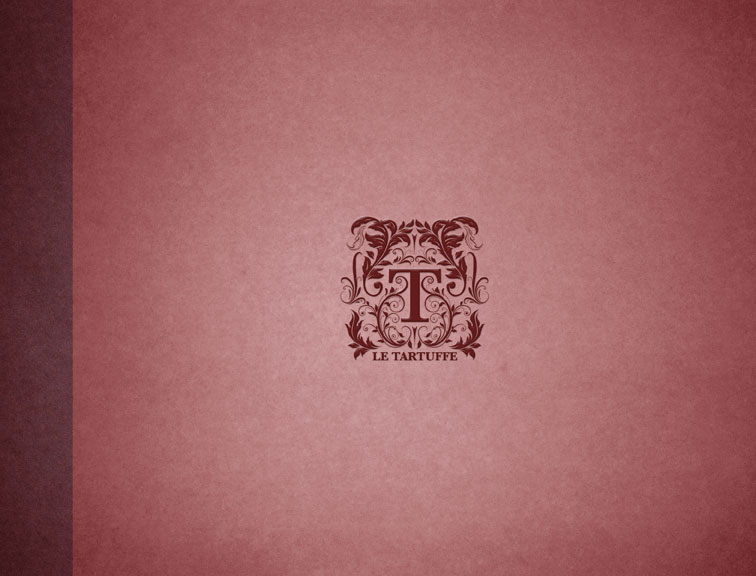
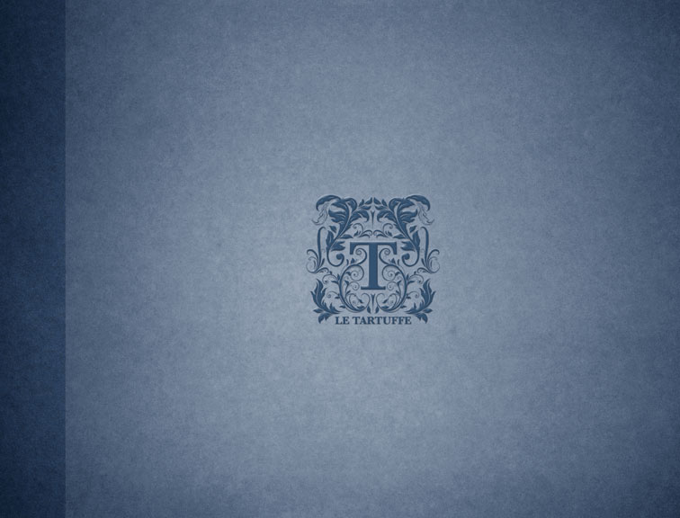
The two types of treatment I considered for the cover logo was embossing or foil stamping as shown below.

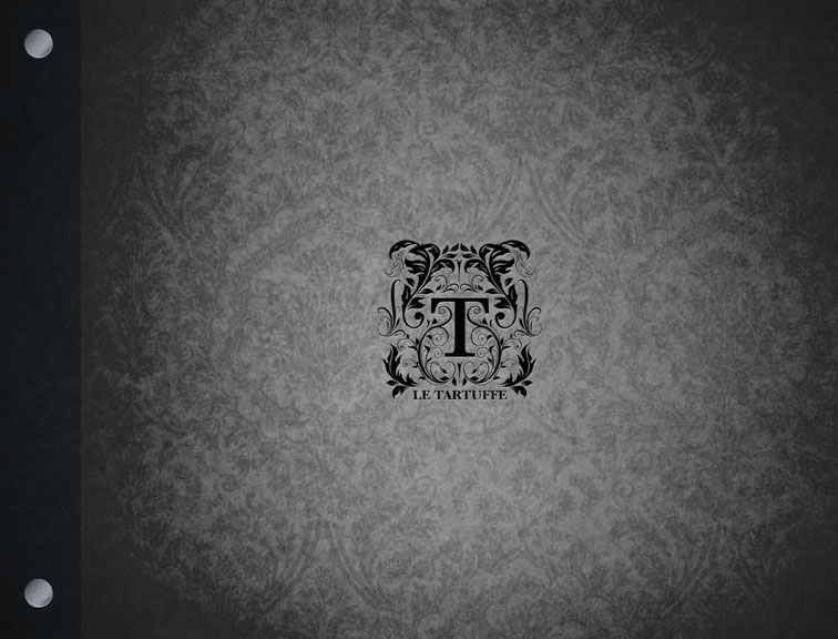
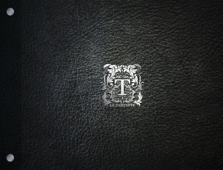
Evening Menu “Le Tartuffe” – The cover
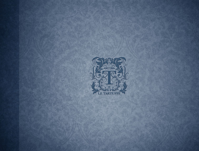
The cover can be of different colors. Red is more harmonious with the existing décor of the restaurant while the dark blue and black make better evening menus. The finish is simple cardboard with or without a texture reminiscent of the floral logo. A dark leather finish is also appropriate. The menu can be bound like a book or secured with extender screws.
Evening Menu “Le Tartuffe” – The menu layout
Both layout are bilingual with the English menu on the left and the French on the right side. The page is divided in two column separating the “entrées” from the main course. The first layout is bound like a book and is composed of a floral pattern background with the menu page snuggly inserted in corner holders. This makes replacement easy if the menu is changed or damaged. The typography used for the courses in this layout is the same as the square logo. The second layout is attach to the cover via the screws. This is more sturdy and still easy to replace if needed. This layout had the second logo in mind hence the script typography for the courses. Both menus have sans-serif typography for readability and contrast with the courses title.


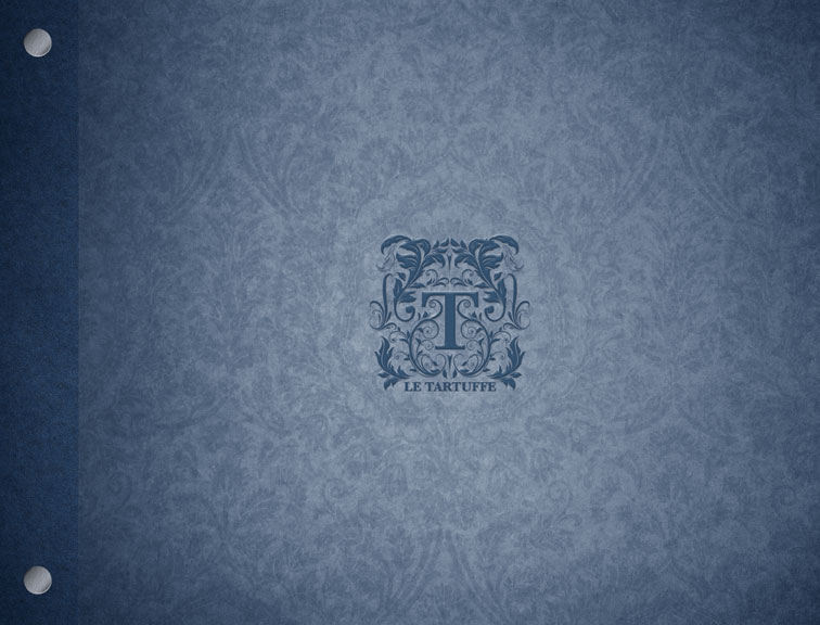
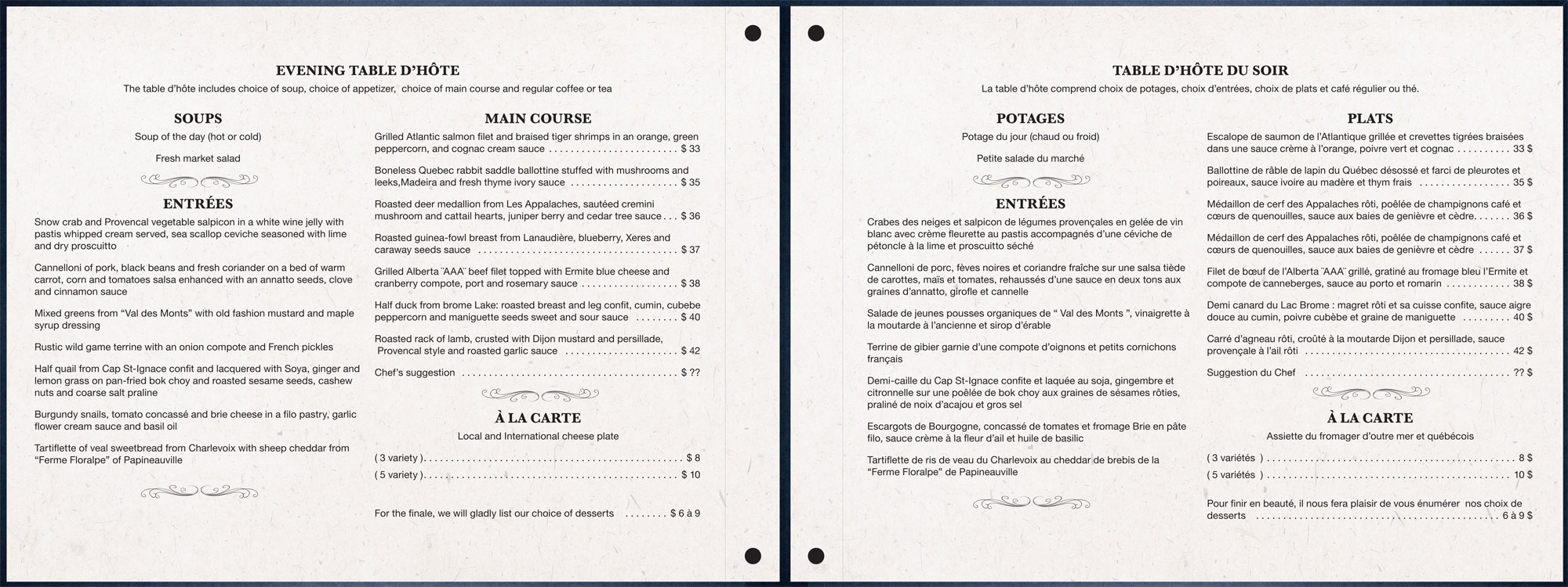
Evening Menu “Le Tartuffe” – The final product
The new signature and typographical ornaments are reminiscent of the days of Louis XIV and the “Tartuffe” play. Royal blue with floral patterns increases the classic look of the cover and is suitable for a evening menu. In addition, screw binders allow you to change the menu inside if necessary.
The interior is simple and classic. The English menu is arranged on the left while the French is on the right side. The typeface with serifs used for titles is reminiscent of the new logo, while the description of the menu is composed of a highly legible sans serif typeface. The content is arranged in two columns to clearly separate the “Entrées” from the main course, while a separator inspired the decorative logo divides the different services.
copyright 2010
